From the VCAA study design:
Design principles are accepted characteristics that contribute to the functionality, usability and appearance of solutions. In this study the principles related to usability include
- ease of use,
- flexibility and robustness, and
- accessibility, including navigation and error tolerance.
Design principles related to appearance are
- alignment,
- balance,
- contrast,
- image use,
- space, and
- text and table formatting.
|
Usability |
Robustness
- The ability of a computer system to cope with errors during execution.
- The ability of a solution to continue operating despite abnormalities in data inputs, calculations
- Making a product insensitive to variations it may encounter.
Resists failing in the face of:
- Invalid data (by using comprehensive data validation)
Resists failing in the face of becoming overloaded
- by queuing incoming work
- by being scalable
- by using high-capacity components
- by using redundant equipment (e.g. standby cooling fans)
Resists failing in the face of runtime errors
- by testing the amount of free memory before allocating it;
- by checking free disk space before saving;
- by checking printer/network availability before relying on them
Resists failing in the face of user error (see error tolerance later)
- by anticipating common errors and gracefully handling them
- by checking for input error (e.g. a browser may quietly ignore malformed HTML)
Use reliable components, such as trustworthy, secure, up-to-date
Anticipates future requirements
- A value that is now always integer may at some stage need decimal places (e.g. GST rate)
- A small value may one day outgrow a confining data type (e.g. using the small byte data type won’t cope if the value rises above 255.)
Anticipates future requirements
- Enforcing a 4-digit postcode will fail if you later get US customers.
- Using 2-digit years before 2000.
Anticipates and allows uncommon conditions, e.g.
- Don’t forbid spaces in family names (fails for von Zeppelin, de Kretser)
- A street name without a street type (e.g. “11 Broadway”)
Can be helped with thorough and imaginative testing.
- But can be costly in terms of time and effort during design, development & testing.
|
Flexibility
Flexibility – the ability of a solution to adapt to new or changed conditions or requirements.
Flexibility – a solution that can be used for more than one purpose.
- e.g. a tablet that converts into a laptop computer
- a user manual that also contains tutorials.
- a router box that includes a WAP, print server, ADSL modem, switch.
e.g. a WAP that copes with A,B,G,N, AC wireless protocols.
e.g. email software that handles IMAP and POP.
e.g. word processor that can import a variety of text from other formats, products or previous versions.
e.g. USB 3.0 ports that are backwardly-compatible with USB 1.0, 2.0 products.
e.g. an OS like MS Windows 10 that can still run programs from decades earlier.
Achieving flexible solutions…
- Don’t build in constants (e.g. 10% GST) that cannot later be changed. Use an .ini file or registry to store settings.
- Let users customise their settings, shortcuts, preferences, menus, themes, layouts
- Avoid making restrictive assumptions (e.g. all users will have mice & large monitors)
Flexible solutions…
- Can deal with a variety of related requirements, e.g.
- software that can burn CD, DVD, Blu-Ray in +R, -R, +RW, -RW formats and also disk images (ISO)
Flexible solutions…
- Cater for a variety of users – e.g. command entry using menus, keyboard shortcuts, buttons, toolbars.
- Can be configured for regional differences, e.g. language, spell-check dictionaries, date formats, currencies.
E.g. multimodal solution that lets users choose to have either
- full control over the sequence and speed of information, or
- an automatic presentation.
Browser software that can
- Display webpages
- Open PDF files
- Play music and video
- Play games and run apps
- Read eBooks
- Narrate text aloud
- Access email
- Act as personal assistants
- Scan for viruses
Warning – flexibility comes at a cost. Common downsides of flexibility:
- It does many jobs, but all of them are done at a basic level of
- It will take more time and effort to develop
- It will be expensive to buy, or it will be BIG.
- Its irrelevant functionality (‘bloat’) may annoy users or make essential functions harder to perform.
Software bloat…
http://www.27months.com/2009/03/the-virtues-of-small-software/
|
Ease of use
Ease of use is important for
- Beginners, children
- Occasional users
- People with special needs (see ‘Accessibility’)
Use task automation
- Wizards
- Macros
- ‘Express settings’
- Beginner / Expert modes

Affordance – where an interface leads users to naturally take correct steps.
Creates an “intuitive” interface requiring little training.
Affordance
e.g. a 3D button that looks like it should be clicked with the mouse.

Affordance
- e.g. Red text that automatically suggests danger or urgency.
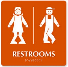
- Icons that need few language skills to interpret

Affordance -
A display that shakes when incorrect data is entered, as if shaking its head.

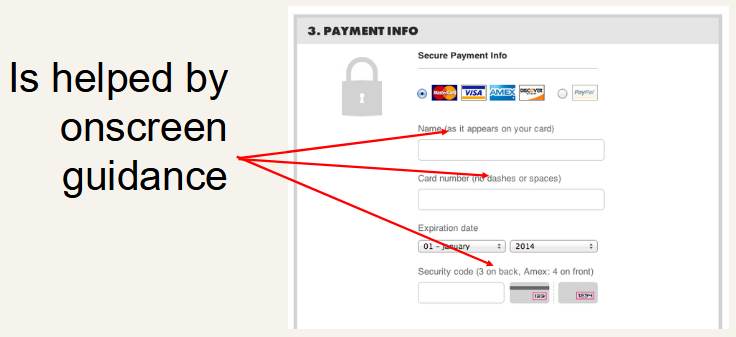
Is helped by…
- Context-sensitive help
- Online documentation
- Tool tips
- Onscreen instructions
Is helped by…
|
Functionality Design Principles |
2. Accessibility including
- navigation
- error tolerance
Above: poor navigation and poor error tolerance
Accessibility
In VCE IT relates to catering for people with disabilities or special needs.
Disabilities or special needs.
e.g.
- Poor vision
- Poor coordination, tremors
- Weak language skills
- Missing or non-functional limbs
- Intellectual disability
- Extreme youth or age
- Lack of tech knowledge
Colour
Blindness
Accessibility
It does not refer to information being easy to find, or quick to download. |
Accessibility > Navigation
Give users a choice of how to navigate e.g.
- Shortcut keys
- Menu bars/ribbons
- Drop-down menus
- Buttons
- Voice input
- Screen taps
- Make navigation controls easy to find, e.g. top or side of screen
- Make nav work regardless of screen size or input method
- Make navigation controls big enough to easily read and click
- Minimise clicks/typing required (e.g. open a menu on mouse-over rather than a click)n
|
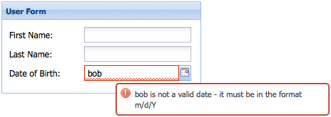
Accessibility > Error Tolerance
Error tolerance
- Anticipating and coping with user errors
Common errors
- Clicking the wrong button
- Entering invalid data
- Not entering mandatory data
- Selecting unavailable options
Error |
Tolerant handling |
Clicking the wrong button |
Always offer a ‘Back’ or ‘Cancel’ link.
Confirm serious actions (‘Are you sure you want to…’) |
Entering invalid data |
Range or type validation.
Give on-screen tips about data formats and types.
Use appropriate GUI data entry controls |
Not entering mandatory data |
Existence validation. Clearly mark fields that are required. |
Selecting unavailable options |
Don’t offer options that make no sense.
Grey out unavailable options.
Disable buttons that are currently unacceptable. |
Error |
Tolerant handling |
Accidental data loss |
Provide multiple-undo;
delete to a recoverable bin;
background saving of documents. |
Typing errors |
Spell checking;
auto-correction (e.g. “Did you mean…?”, or quietly adding a missing Http:// to a URL) |
Lack of skill |
Anticipatory advice (e.g. “This will take some time. Do you want to continue?”)
Diagnostic information (“You can’t edit this layer because it is locked. Unlock it in the ‘Edit’ menu.”)
Tool tips, context-sensitive help. |
Accidental mouse click |
Trigger event on mouse-up event, not mouse-down. User can slide mouse pointer off the button and not trigger the event. |
|
Appearance |
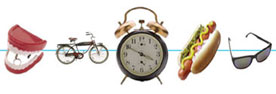
Alignment
Alignment – the lining-up of objects to group or organise them
- horizontal
- vertical
- diagonal
- left / right edge, centred

Diagonal alignment
Creates a feeling of imbalance, movement, action.
Centred vertically
Centred horizontally
Vertical menu

Horizontal menu

Powerpoint automatically shows alignment (with dotted red lines) as objects are moved around.
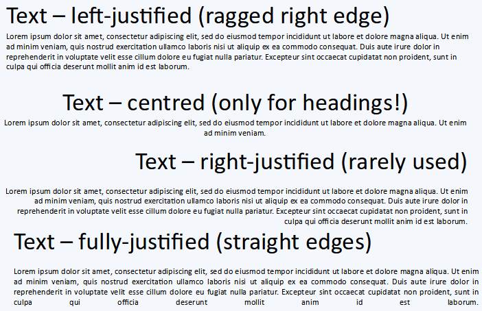
Right-justified text is rarely used, but can be effective when wisely-chosen...

|
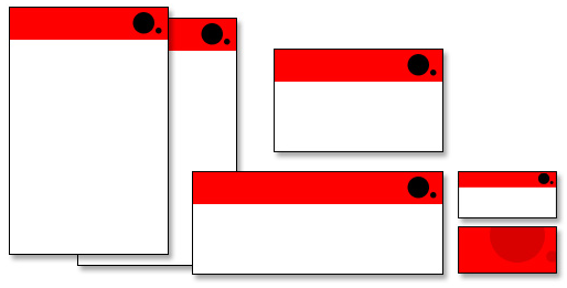
Repetition
The repeated use of visual elements creates a sense of unity, predictability and consistency.
Lets users extract information quickly.
e.g.
- All main headings are 24 point, bold, sans serif.
- All links are underlined.
- An icon always means the same thing on all pages.
- The same colour scheme is used throughout
- Menus always appear in the same place on every page
And a sudden change to a repeated element will draw attention to it more dramatically.
e.g. suddenly making some text bold or coloured so it stands out from the usual text.
|
Contrast
Contrast
The difference between foreground and background colours. Greatly affects readability.

An example of poor contrast: the background fights the information in the foreground:
|
Space
Space – refers to the distance around or between visual elements.
There is positive and negative space.
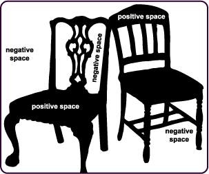
- Positive space represents the object.
- Negative space surrounds the object.
- If you see a vase, the white is positive space.
- If you see faces, the black is the positive space.
- Creative use of positive and negative space can lead to dramatic and eye-catching results


Space may also include (non-examinable) the concept of proximity
- Items that are close to each other are more likely to be related or connected.
- Items that are visually separated are visually differentiated (like paragraphs of text with space between them)
Clever use of space can
- establish contrast, emphasis and hierarchy;
- generate drama and tension;
- provide visual rest between groups of elements;
- make an item stand out as being separate or different (like this line)
Space also is important in helping legibility and readability. Which of these would you rather read?
Poor spacing |
Good space |
Lorem ipsum dolor sit amet, consectetur adipiscing elit. Aenean volutpat enim id nulla molestie, et vulputate dui venenatis. Curabitur egestas elit ullamcorper nisl laoreet posuere. Integer condimentum dolor arcu, in tincidunt mi molestie a. In hac habitasse platea dictumst. Vivamus luctus, elit vitae molestie laoreet, risus turpis auctor eros, a posuere elit urna eget tellus. Vivamus a efficitur mi, ac viverra lorem. Ut viverra purus eget leo tempor imperdiet. Suspendisse ac orci lorem. Interdum et malesuada fames ac ante ipsum primis in faucibus. Morbi ac pharetra felis. Nulla eu ullamcorper ligula, ac laoreet dui. Etiam bibendum, lectus nec consectetur condimentum, orci nibh convallis lectus, non bibendum velit mi at purus. Aliquam vulputate placerat interdum. Maecenas condimentum felis a lacus ultricies, vitae eleifend nisl luctus. Fusce semper mauris aliquam nibh elementum tristique. Nam nec laoreet purus. |
Lorem ipsum dolor sit amet, consectetur adipiscing elit. Aenean volutpat enim id nulla molestie, et vulputate dui venenatis. Curabitur egestas elit ullamcorper nisl laoreet posuere. Integer condimentum dolor arcu, in tincidunt mi molestie a.
In hac habitasse platea dictumst. Vivamus luctus, elit vitae molestie laoreet, risus turpis auctor eros, a posuere elit urna eget tellus. Vivamus a efficitur mi, ac viverra lorem. Ut viverra purus eget leo tempor imperdiet. Suspendisse ac orci lorem. Interdum et malesuada fames ac ante ipsum primis in faucibus. Morbi ac pharetra felis. Nulla eu ullamcorper ligula, ac laoreet dui.
Etiam bibendum, lectus nec consectetur condimentum, orci nibh convallis lectus, non bibendum velit mi at purus. Aliquam vulputate placerat interdum. Maecenas condimentum felis a lacus ultricies, vitae eleifend nisl luctus. Fusce semper mauris aliquam nibh elementum tristique. Nam nec laoreet purus. |
The use of space also conveys qualities of
- Maturity
- Elegance
- Sophistication,
- Quality
- Simplicity
- Luxury
- Confidence
- Honesty
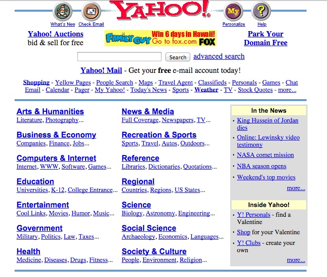
Before Google, search engine front pages looked like this……
Then Google came and this - believe it or not - was revolutionary in its day…
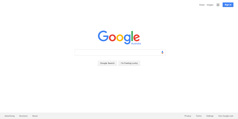
The moral… don’t crowd pages and cram in as much text as possible.

Use multiple pages or screens instead.
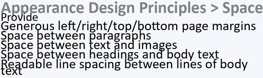
Provide
- Generous left/right/top/bottom page margins
- Space between paragraphs
- Space between text and images
- Space between headings and body text
- Readable line spacing between lines of body text
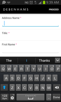
- Otherwise you’ll end up with something like this…
Use the space provided.
A phone display, for example is usually tall and narrow when the phone is held normally.
Align labels and text fields vertically to make best use of the space.
|
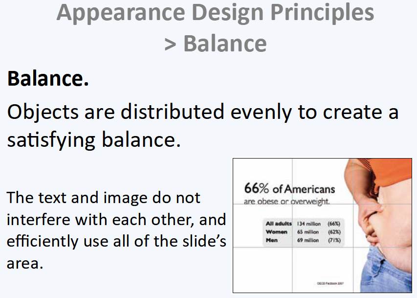
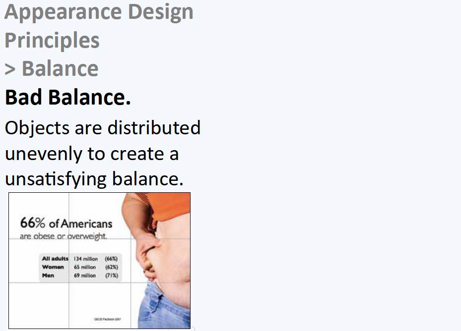
Balance
Balance. Objects are distributed evenly to create a satisfying balance.
The penguin needs to stand alone and dominate the left of the image, so the text is right-justified and balance it on the right.
Compare these two slides...
Number 1...
And number 2...
And in conclusion, compare these two slides. Which is better, and why?
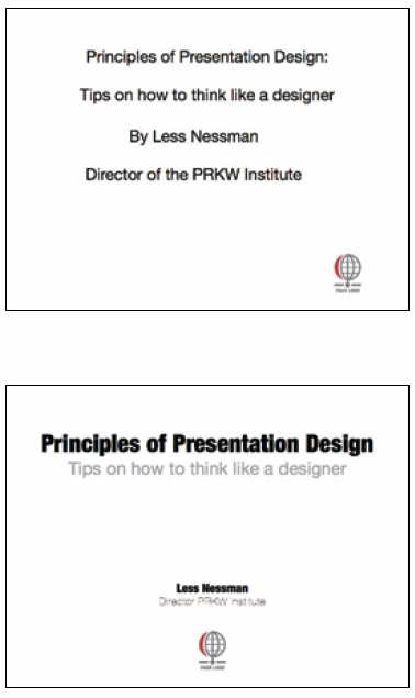
The top slide lacks design. The heading is not bold enough. The subtitle is not appropriately demoted. The alignment of the logo is wonky.
Space is poorly distributed.
The bottom slide has symmetry. Related items are visually together (i.e. good proximity). Contrast focuses attention on main info.
The main information is well separated from the subsidiary information.
We can only assume that Less Nessman did not design the slide - otherwise the name and title would have been much bolder and bigger :-)
|
Since you’ve been so good, here’s a picture you can look at

OK. You can stop now. |
|
|
|
