![]()
Infographics
(IG)
also see Data Visualisation
|
Infographics(IG)also see Data Visualisation
|
OK. Let's just look at this for 5 seconds.
What does it tell you in an instant? How does it get so much information to you so quickly, yet so clearly? Infographics, when done well, pack a lot of powerful information in a short, sharp punch of easily-absorbed shapes, colours and lines.
|
The very basics of decent infographics (IGs)An Infographic (IG) is designed to present data so that it is
Effective Infographics compress large amounts of data into simple pictures that are easily understood by most people. As a test, the best Infographics would work even if the viewer did not speak the language of the infographic's creator. Common components in Infographics
|
Who produces infographics, and why?People or organisations who want to inform, educate or persuade people who are resistant to deep thought and detailed statistics, i.e. the average citizen who is uninterested in the topic the producer is promoting. Let's face it: infographics are the junk food of data presentation. Infographics boil down complex ideas and statistics into easy-to-chew factoids. This is not a criticism: it's a fact. Don't get me wrong. I like infographics! They are soft, friendly and comfortable interfaces to facts that are sometimes hard, spiky and disturbing. For example, government authorities have long fought to keep their citizens from killing themselves doing stupid things. An earnest lecture on safety near trains is one response. Here is another - vastly more influential and effective. It is the musical equivalent of an infographic that gets vital and complex information to the general (sometimes uneducated or uninterested) masses. It is the famous and impossible-to-forget Dumb Ways to Die video and song. (I love it)
Tip: don't use your private parts as piranha bait, and don't drive around railway level crossing gates. A good infographic will draw viewers in and absorb their attention. It will make them curious and make them think. They will pay attention to your message. If that happens, the infographic is GOOD.
|
Typical infographic features, using examples |
|
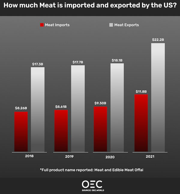
Let's start with a simple example, using a graph. Graphs are probably the most common and effective components of infographics.
Note the use of colour to differentiate betweeen the imports/exports and The numeric values (e.g. $8.26B) are provided, but are probably not even noticed by 90% of viewers. The main message of the infographic? Easy: some place (the US) exports a lot more meat than it imports. And two more seconds of looking reveals that the difference between exports and imports is increasing. Job done. Point made. No brain cells were strained in the transmission of this information. Notice how the main points (the sizes of imports and exports over time) are simply presented using an analogue display - taller bars means more stuff. But the numeric data is also provided for people who are interested in absolute numerical values (e.g. "Is that millions or billions we're talking about?") And the source of the data is provided for truly-interested people to investigate the data more closely.
|
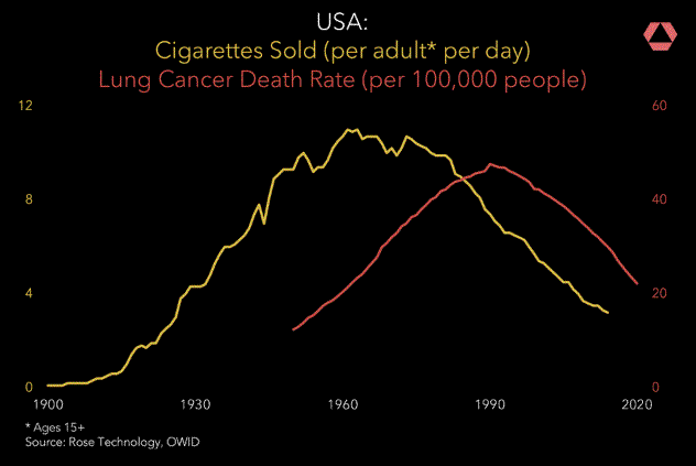
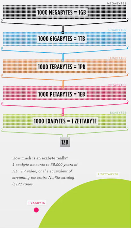
Some numbers are beyond imaginationSometimes the human imagination simply cannot comprehend the scale of values you want to convey. Infographics try to visualise values that defy imagination. e.g. what is the difference between a million seconds and a billion seconds? A million seconds is 12 days. A billion seconds is 31 years. Humans do not handle big numbers well. We are small apes hoping to find juicy fruit on trees, We do not naturally deal well with astronomical quantities. Hence: infographics |
 |
|
|
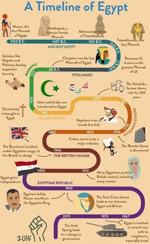
Some IG examplesBelow: minimum text, maximum picture. Clearly laid out and easy to interpret the relation of the parts to the whole.
Below: minimal text, useful images, laid out in a logical order. The dotted line establishes the direction of flow of the data.
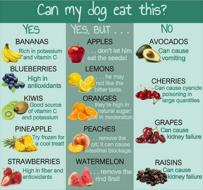
Below - attractive pictures, few words (about 6 per topic). Simple heading. Neatly divided into 3 clear categories in columns that use background shading to separate them.
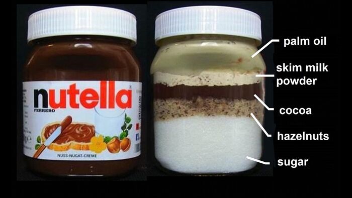
Below: a cunningly-fabricated IG revealing the contents of a product using visible layers of different heights to convey their relative quantities.
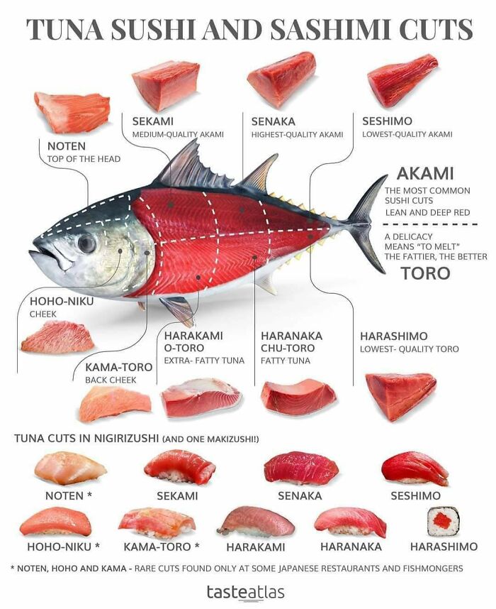
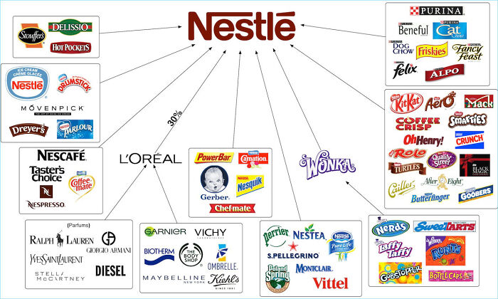
Below: an information-dense chart breaking down a complex mass of related companies into a simple overview.
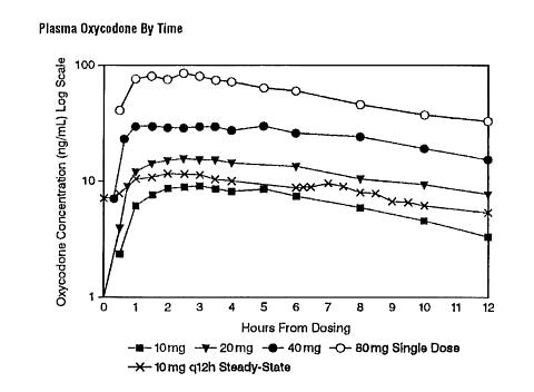
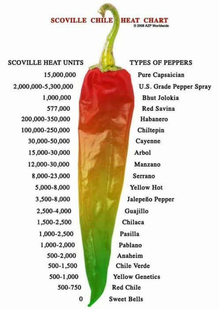
Below - it sorts the heat units logically, but could do better to demonstrate that (for example) the top heat unit is about seven times larger than the second heat unit. Ratios matter!
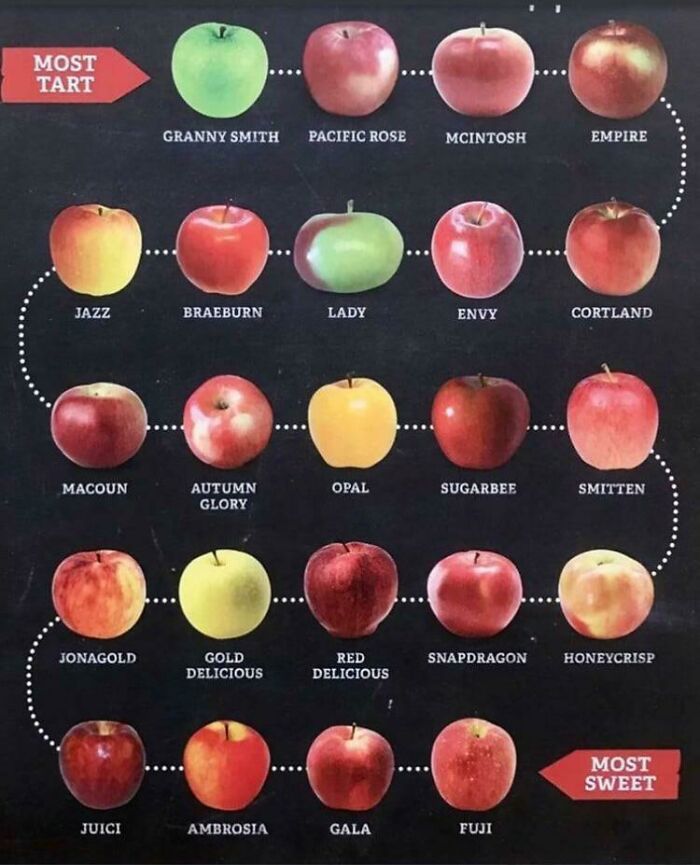
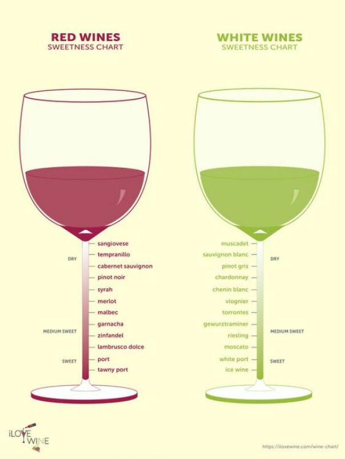
Below: the pictures are not really informative but their stems serve as a scale for the sweetness values. As with the chilli IG, however, the levels of sweetness are all shown using the same vertical scale whereas one wine is probably MUCH sweeter than its neighbour on the scale. Could do better!
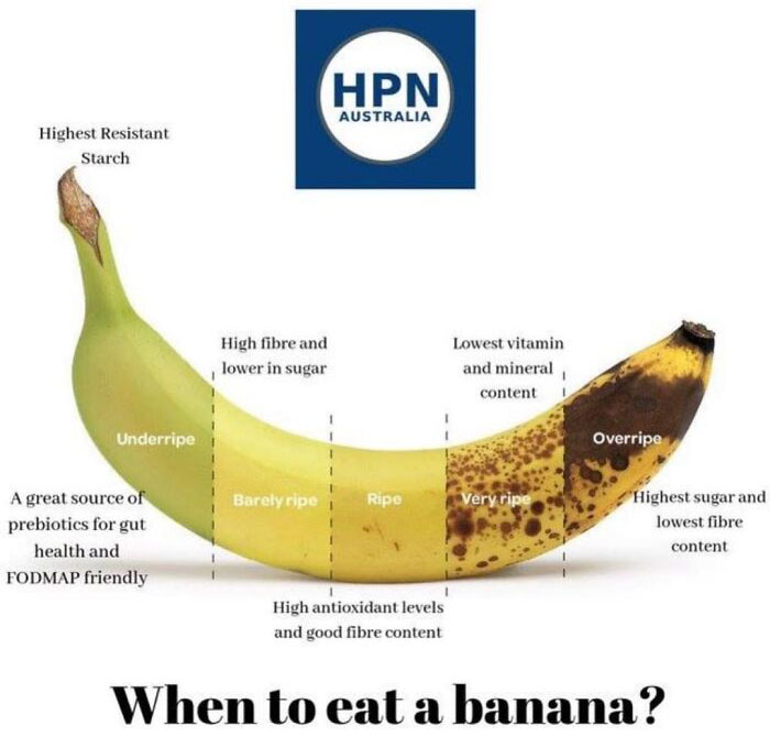
Below: it's a clever graphic... but it doesn't actually say when to eat the banana: it describes its state of ripeness. In how many days will an underripe banana become ripe? The text about starch, sugar and fibre etc is also not related to the main heading of the IG. This IG advertises one thing and delivers other things.
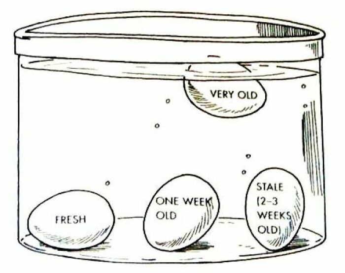
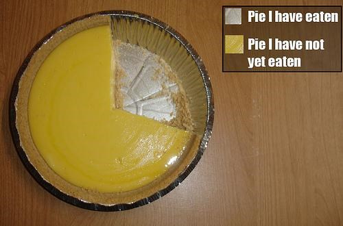
Below: Could an IG get any more basic? The picture is vital to the information, and is easy to interpret.
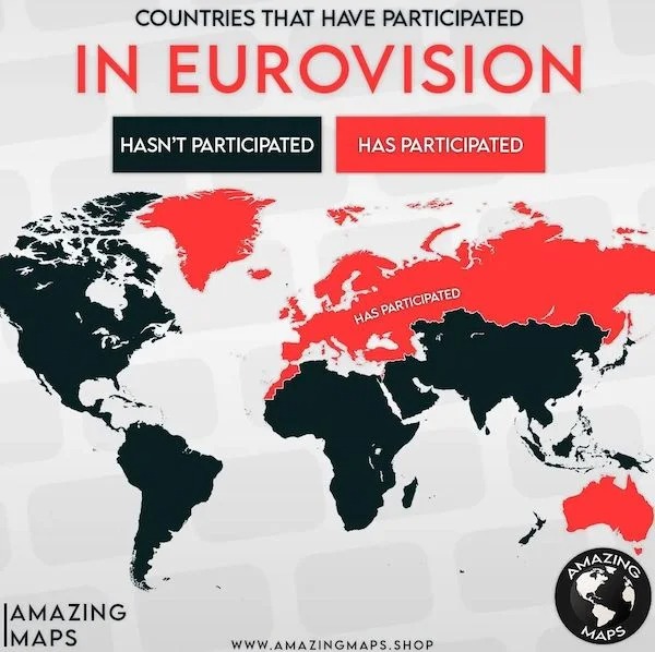
Below: Maps commonly appear in IGs to show geographic data. This one makes Australia stand out! But I still don't know why Australia is in Eurovision. IGs can't answer every question.
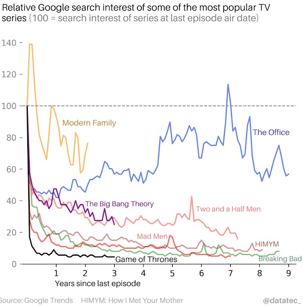
Below: some IGs are more information-dense than others. Compare the Eurovision IG with this one which tries to condense the popularity of quite a few TV shows over time. Note the use of colour to separate the graph lines of each show. The graph's axes (search interest vs show's age) is very important in interpreting the data correctly. With some effort, you can discern that nearly all shows have been Googled less after their final episodes, except for The Office and Modern Family which have not subsided much in popularity since their last episodes aired. In fact, Modern Family's search rating skyrocketed just after it concluded, and The Office seems to be increasingly Googled as time passes. Game of Thrones, however, fell off a figurative cliff after it ended. (If you watched the last series, you will need no explanation why.)
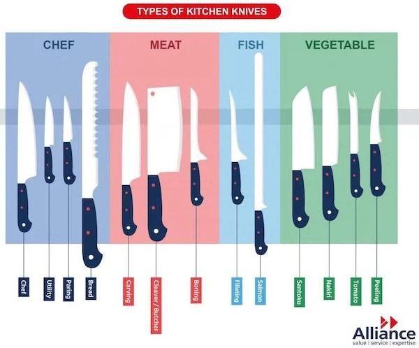
Below - The title is clear and simple. The categories of knife (e.g. chef, meat) are clearly separated by the use of background colour. The accurate shapes and relative sizes of the pictures are vital to the IG. The specific purposes of each knife are provided, almost incidentally, in small vertical print at the bottom of the IG. Perhaps they could be bigger, but the creator of the IG apparently did not want to highlight that information. You can usually tell the importance of information in an IG by its relative size.
Below - if you had to tell someone about the different parts of a runway, would you write an essay or draw a picture? The choice of using an IG is often a no-brainer. Note the sharp contrast between the colours of the text captions (e.g. Aiming Point) and their background colours. Readability is crucial in an IG.
|
A good IG will put information in a form that non-experts can understand...
|
Animated Infographics |
While IGs may present data clearly, the human eye is drawn to movement. Meaningful movement, such as the twitch of a snake's tail in long grass, helped Homo sapiens survive long enough to create animated graphics. For example - movement to show change in action. |
If you have 18 minutes free, please watch David McCandless' Ted talk in which he turns complex data sets (like worldwide military spending, media buzz, Facebook status updates) into beautiful, simple diagrams. And you can't go past statistics guru Hans Rosling's classic 2006 Ted talk in which statistics come alive.
|
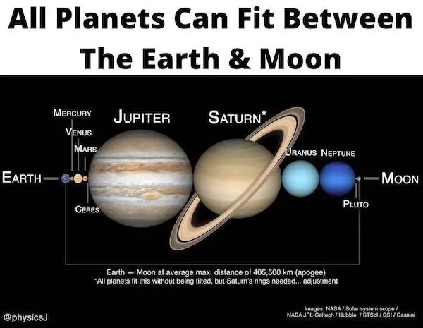
How could one explain this concept in words? An IG is far more effective.
|
|
Still with me? Good. Now let's look at some BEAUTIFUL infographics.How beautiful? So beautiful that you'd leave your imaginary girlfriend for them.Yeah. That beautiful.OK. So, maybe not that beautiful, but pretty good ones. |
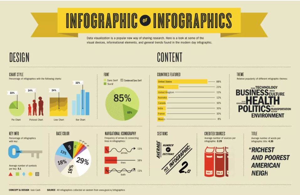
A handy IG about IGs.
|
Trying to make a point:
|
If I had to comment, I'd say the grey background does not provide optimum contrast to the blue graphics.
|
A great place to visit on a cold afternoon: https://informationisbeautiful.net/ For example, this user-interactive chart of data breaches over time. Click on a circle to see its details. |
|
 |
Tips For Creating Effective Infographics |
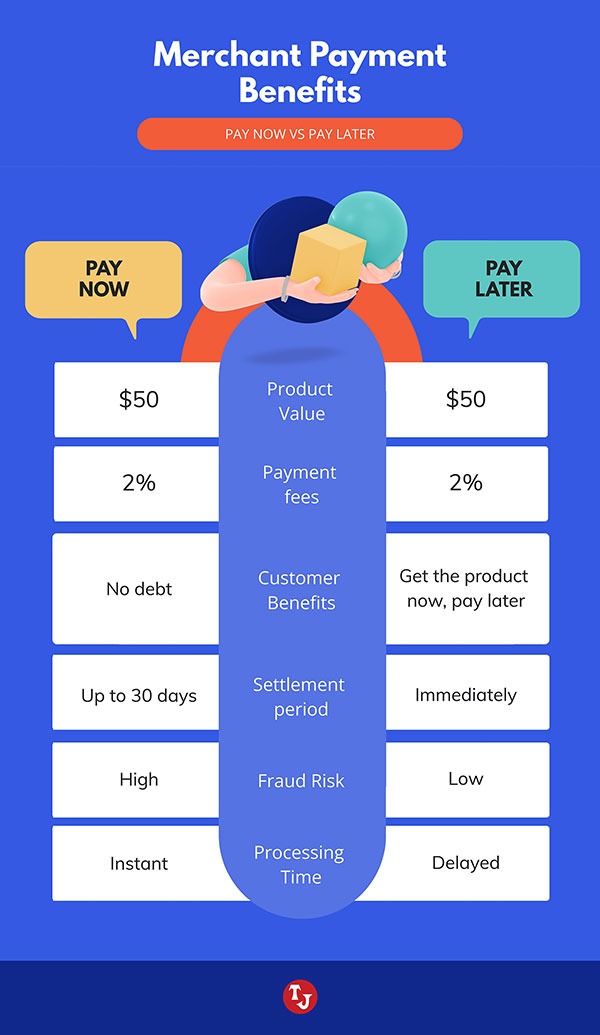
Know exactly what information you want to give. Don't be vague or try to cover more than one main topic. Pick a point and stick to it. Choose the best medium. Chart? What type - pie or line? Is the most important thing the most visible? If not, fix it. Could anyone but the creator understand its main message in under a minute? Is is attractive / interesting / fun / fascinating / gripping enough to look at for 15 seconds? If not - your audience has already clicked away. Does it have too many words? Many viewers may not speak your language well, or want to read anything much at all. If a word is not vital to the main message, delete it. Are colours being used to add information, e.g. to group related items into a single category? If not, don't use colour just for fun. Make it work for you. Is it readable? Is the text large enough to read? Is the more-important text BIGGER than the less-important text? Is there clear contrast between text/background colours? Will it be static (no animation or user input) or dynamic (animated, may respond to user input)? Each type requires its own software tools and delivery platforms. Learn your tools for the job. Do you need to use a spreadsheet, graphics editor, slideshow program, audio editor, video editor? Maybe all of them? Design so the main point stands out the most. e.g. if you are comparing two alternatives, make the two sides visually stand out. For example: the two alternatives blow are visually separated by the bar in the middle.
If you're tempted to add a table to your IG, think twice. Tables imply quite a high proportion of text and numbers - neither of which goes well with effective infographics.
|
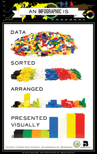
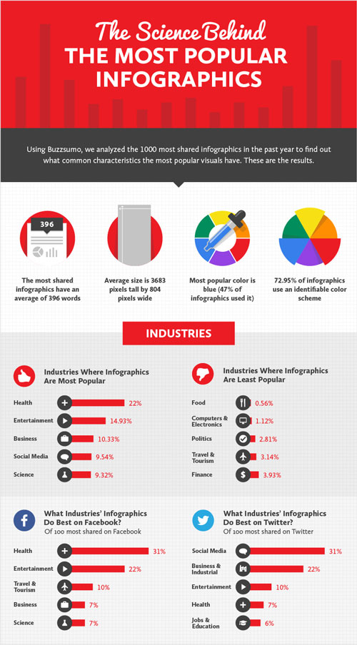
And in conclusion, may I present the most meta infographic:
|
|
Go back to wherever you were before this page All original content copyright ©
vcedata.com This page was created on 2022-05-21 |