
![]()
Data Visualisation (DV)
also see Infographics
Data for the eyeballs, not for the brain™
| 10900001.8 | 10900001.8 | |
5100000.09 |
 |
5100000.09 |
| 980088.899 | 980088.899 |
Numbers are hard.
Look at these:
10900001.8
5100000.09
980088.899
Which is the biggest? You have 2 seconds. Starting now. Time's up. You're wrong.
Brain is stupid. It says: starts with big number, must be bigger.
Brain needs to be smacked in the anterior cortex. Brain can be dumb.
That's why most shops sell things for $39.99 instead of $40.00. Because a 3 is less than a 4, obvs.
We're saving X%, but we don't really know percents.
Whatever. 3 is cheaper than 4. Right?

We need eyes! Eyes are wise. Eyes see analogue stuff. Eyes are good. With many exceptions, such as this:
Numerical data can be tricksy, but eyes can be handy at times like that.
Look at the preceding data in an analogue format - analogue uses sizes, shapes and directions rather than (digital) numerals to convey information:
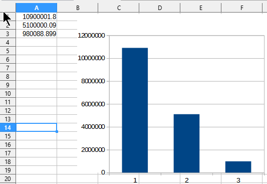
In a glance, which presentation of the data is more meaningful?
If you say, "the numerals" you are the sort of person I call "punchworthy". I meet a lot of people like that.
Actually, I don't meet them. I avoid them. If I can't avoid them, they get punched. It's not my fault. They started it.
Level 1 completed! Yay.
You now know that data can be presented as
- digital - as numbers, numerals e.g. 0-9
- analogue - sizes, colours, angles or shapes
(So if data is presented digitally, can it also be presented analoguely? Hmmm. The English teacher part of me is fascinated.)
When in doubt, compare a digital watch (with hour/minute numbers) and an analogue watch (with hands of different lengths that are moving to point to different places)
Digital data is good for computers who cannot read easily interpret shapes, sizes and positions.
Analogue data is good for humans who cannot easily read numbers.
To get computers to present their digital data in a form humans can easily understand, some data conversion is needed.
Such conversion is called data visualisation (DV). DV is a pictorial summary of numeric data.
Fun Burger Fact - in America, A&W Restaurants released a "third-pound burger" to compete with McDonald's "quarter-pound burger".
Sales of the A&W burger failed because Americans throught that one out of three must be smaller than one out of four. Because numbers.
They could have used analogue data - visualised - to better show their meaning...
| OUR THIRD-POUND BURGER | THEIR QUARTER-POUND BURGER |
 |
 |
But they didn't. They overestimated the power of the modern brain's ability to process numbers.
Numbers are a recent and artificial phenomenon. Sizes and shapes are what comes naturally to our reptilian brains.
Our brains have evolved to process analogue data, and that is why data visualisation can be so powerful. They make artificial numbers REAL.
So, shall we begin?
Major categories of data visualisations
Static - e.g. graphs and charts of data at a fixed time. These stay still.
Dynamic - e.g. data animations to show changes over time. These move!
Graphs and charts
The most common DV tool is the graph, or chart. There is supposed to be a subtle difference between graphs and charts, but we might as well use the terms freely.
There are a few major types of graphs, each with a particular purpose. Choose an appropriate chart type based on what you intend to demonstrate, such as:
- how values change over time
- the components of something
- how data varies from an average trend
- comparisons of the sizes of different things
- the relationship between different variables
Some data may freely be represented in two or more different chart types. e.g. a line graph or bar chart can equally show changes in values over time. Other chart types - especially the pie chart - are very specific in their application. Choose your graph type with great care!
These charts are easily produced in spreadsheet software, or dedicated DV tools. There are many more types of graphs and charts than those described below, but here are the main ones.
Line graphs - to show changes of values over time

Note the use of conventions: the standard, "normal" techniques that people expect to see used.
- A title for the graph.
- Time is shown on the horizontal X axis. Values are shown on the vertical Y axis.
- The axes should be labelled. In this case, the Y axis is not.
- The use of colour for different lines.
- Horizontal guide lines to make it easier to read the values for the data points.
Bar Graphs - to compare quantities of different things using bars of different heights/lengths.
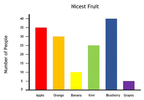
Again, colour can be used to visually distinguish the different categories. In a black and white medium (e.g. printed) patterns or textures can be used instead of colour.
The height of each bar makes the differences in values clear. The actual raw numbers are relatively unimportant. The graph is emphasizing the relative differences in values.
Some bar charts use horizontal bars - there is no difference in their readability.
Pie Charts - to show the components of a whole. They look like a sliced pie. They are only used to show the relative sizes of the parts of a whole thing. They should not be misused for other purposes.
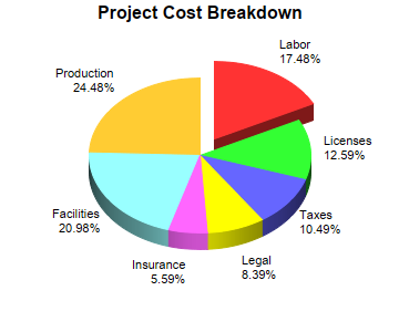
Again, colour is used to distinguish the parts, which are all labelled. The percentages are not compulsory - but if they're given they should add up to 100%.
This example shows one slice "exploded" to make it stand out from the rest.
A variation of the pie chart theme is the doughnut (with a hole in the middle of the pie)
Warning: do not try to create a pie chart with too many slices. They become impossibly small and hard to decipher.
Area Charts - are line graphs with colours filling the area beneath the line
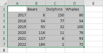
Examples (source)
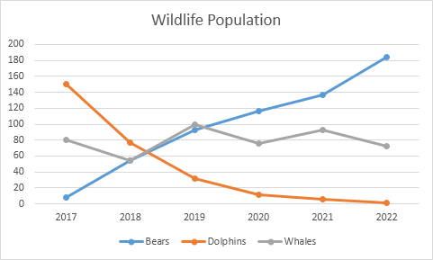
The original data:
As a line graph:
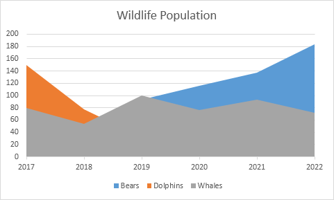
As an area graph. The different areas overlap, making some of the data invisible, which may not suit you.
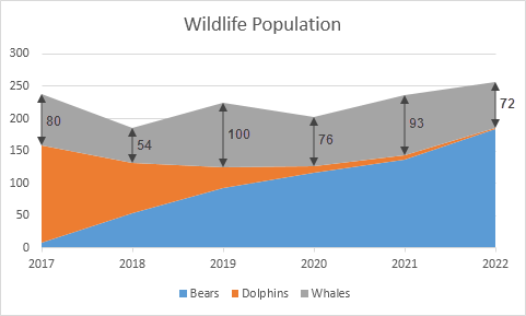
As a stacked area chart, the data is no longer obscured. Notice how the dolphin numbers seem to finish at a value of 150 according to the Y axis, but are actually just 1. It's the vertical height of the orange area at the 2022 mark that tells you the number is very small.
This is the role of DV - to give a quick, visual summary of detailed data, not to reproduce numerical data in its full detail.
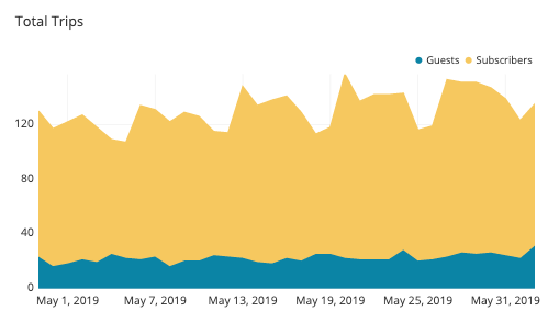
In this example, you can see how a stacked area chart shows not only a clear comparison between two classes (guests vs subscribers) but also their relative contribution to the total on the Y axis. A line graph would accomplish the same effect, but the added colour fill of the area chart is a little more powerful.
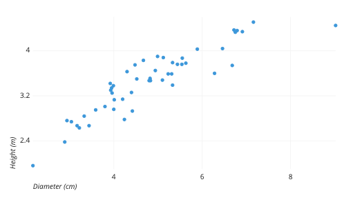
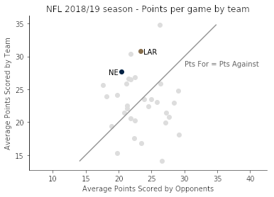
Scatter Plot - shows data points as single dots. They are used when data are spread out and do not neatly follow a single path, as in a line graph. They are good to show the variation in values of one variable at different points in a second variable. In the example below, it is immediately apparent that there is a general correlation between height and diameter, but it's not perfect. For example, at a diameter of 4cm, heights varied from about 3.0 to 3.3cm. The spread gives a good visual guide to the data's standard deviation from the mean.
A trend line can be added to more clearly show the average direction of the data.
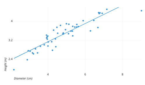
If the data dots do not stray far from the trend line, you can be confident that the arithmetic mean (average) of the data is reliable and representative. If the data points don't seem to follow the trend line at all, the standard deviation is large and so the mean is probably useless or at least unreliable. In the example below, the trend line is either pure imagination or optimism...
Box and Whisker chart - a dense chart for specialists. Warning - this get pretty dense and nerdy and is not examinable. Skip it if you want.
As a demonstration of the wide variety of graphical data representation that is possible, here is an example of a DV that is not as intuitive as the charts shown above. It takes time to learn and interpret, but it packs a lot of information into a small space. It shows the both value and variability of data in a neat package.
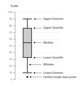
The box (rectangular section) shows the range of the majority of the data.
A quartile is one of a set of important values about a data set.
- The lower quartile (called Q1) is the value lying halfway between the minimum value (aka the lower extreme) and the median value - the middle value. Half of the data values are less than the median, and half are greater than the median. A quarter of all data points lie below the lower quartile.
- The second quartile (called Q2) is the median. The median is a form of average - it's the value that has half of the data set above it, and half of the dataset below it. e.g. out of the data set 2,5,11,16,221,433,988 the median would be 16 because it has 3 values less than it, and 3 greater than it.
- The upper quartile (Q3) is the value lying halfway between the median and the maximum value (a.k.a. the upper extreme). A quarter of all data points lie above the upper quartile.
The 'whiskers' (the lines at the top and bottom of the box) show the range of the more extreme data.
The really unusual data observations ('outliers') are shown as single dots, just to show how weird some of the data was. Sometimes the outliers are especially interesting to researchers.
So, to read the example shown above:
- The median (average) value is 55. Half of the data is between 55 and 90, half is between 55 and 10.
- The maximum value recorded was 90, the minumum was 10 - so the range of values would be 80. (That's a lot of variance. Stats nerds out there would know it means that the standard deviation of the data is high, meaning the calculated mean of the data would not be really typical of the entire data set.)
- Note that the size of the box is split in the middle by the median. The box will always be split exactly in half, because that's how the quartiles are defined.
- The lengths of the whiskers gives an idea of how the atypical (opposite of typical) data was distributed. In this case, if values were not 'in the box' (within the average range) they were they more likely to be unusually low (longer lower whisker) than high (longer upper whisker).
- One memorable value, of about 4, was recorded.
A rare box-without-whisker chart...

Advanced Data Visualisation Software Tools
Mr Google mentions: Google Charts (obviously!), Tableau, Grafana, Chartist. js, FusionCharts, Datawrapper, Infogram, ChartBlocks, D3.js. etc etc
The best tools offer a variety of visualization styles, are easy to use, and can handle large data sets
Tableau - They say: Data visualization is the graphical representation of information and data. With visual elements like charts, graphs, and maps, data visualization tools provide an accessible way to see and understand trends, outliers, and patterns in data. In the world of big data, data visualization tools and technologies are essential to analyze massive amounts of information and make data-driven decisions. Our culture is visual, including everything from art and advertisements to TV and movies, and our eyes are drawn to colors and patterns. Our interaction with data should reflect this reality.