
Last changed: May 15, 2024 12:36 PM
Applied Computing - Data AnalyticsVCAA Exam Post Mortem 2023
I am open to constructive feedback. Pick a bone with me or offer further information or corrections . Or email Section A students' average mark was: 63% Section B average: 41% Section C average: 34% Why? |
Post Mortem Notes This is not a VCAA publication.
I do not speak for the VCAA, the IT examiners, or exam markers. I was not involved in the writing or marking of this examination. Extracts from exams are all Copyright © VCAA, and are used with permission. Use these post mortems at your own risk. I reserve the right to change my mind completely, at short notice, about anything I've said here. Suggestions, discussions and corrections are welcome. Questions look like this. |
|
Other VCE IT Exam Post Mortems to enjoy IPM / ITA / Informatics / Data Analytics - 2001 | 2002 | 2003 | 2004 | 2005 | 2006 | 2007 | 2008 | 2009 | 2010 | 2011 | 2012 | 2013 | 2014 | 2015 | 2016 | 2023
|
The Post Mortem Awards |
|
Questions that are a complete dog's breakfast |
The new and exciting Sad Dog Award goes to questions that make me sad
There are lots to be sad about this year. |
| 2024-04-25 - now with the great taste of the Examiners' Report | ||||||||||||||||||||
Written examinationTuesday 31 October 2023
Materials supplied
Instructions
At the end of the examination
Students are NOT permitted to bring mobile phones and/or any other unauthorised electronic devices into the examination room. |
||||||||||||||||||||
Examiners' report general comments - added 2024-04-25In Section A
In Section B
In Section C
Areas for improvement include:
Other areas that should be addressed include:
|
SECTION A - Multiple-choice questionsInstructions for Section A Answer all questions in pencil on the answer sheet provided for multiple-choice questions. |
||||||||||||||||
Use the following information to answer Questions 1 and 2. The owner of a new luxury cat boarding house, where cat owners leave their cats while on holiday, is setting up a customer database. |
||||||||||||||||
| A1 | Question 1 The most appropriate data type for a mobile telephone number field would be Answer is A. The examiners are wildly assuming that all students know the format of a mobile phone number. Maybe most students do know - maybe they don't. But exams should not assume knowlege that is beyond the study design. The exam should have given an example number to give students guidance, e.g. '0404 999 444'' to make it clear what the question is trying to examine. The example data is alphanumeric, since it contains leading zeros and alphabetical data (spaces) as well as numerals. It can only be stored as text/string. - Boolean can only store true/false values. - Integer/numeric cannot store spaces, and don't need to be be stored as numbers because no maths wiill be done with the data anyway. Not a good start. I give this a "Cat Is Not Happy At The Luxury Boarding House" award. (I admit, I won't be giving these out very often.)
A mobile telephone number is not needed for a calculation in a database and therefore the most appropriate data type should be text. 50% of students agreed with the official answer. 31% chose D. |
|||||||||||||||
| A2 | Question 2 A field in the database contains data about a cat’s birthday. Which is the most appropriate field name to use? A. catBirthday Answer is A. Three options are awful, and easy to dismiss. Options A to C use 'CamelCase notation' (capitalising the first letters of words within a string), so that's A Good Thing ™. (A) is using Hungarian Notation to indicate the field's table as a prefix, as one would do with staffID, productID, saleID etc. The prefix keeps reminding people of what table the ID belongs to. This is a jolly good idea. (B) is inaccurate. It's not the cat owner's birthday data, it's the cat's. (C) What is the "allThe" rubbish at the beginning? It makes no sense and adds no information. (D) is the incoherent rambling of a deeply disturbed database designer. How can a birthdate be both exact and estimated? Step carefully away from this option.
91% of students agreed with the official answer. |
|||||||||||||||
| A3 | Question 3 Jace is designing a spreadsheet to record data about the different types of flowers in his suburb. He is not worried about the appearance of the spreadsheet; however, he is focused on the functionality. The characteristics of the spreadsheet should include A. usability and appearance. Answer is C.
Let's look at each option in turn using Common Sense ™ A. usability and appearance.
B. repetition, colour, proportion, text hierarchy, text style and titles.
C. robustness, flexibility, ease of use, navigation and error tolerance.
D. navigation, error tolerance, repetition, colour, robustness and ease of use.
So - which of the options stands out with the fewest dodgy components. It has to be C.
90% of students agreed with the official answer |
|||||||||||||||
| A4 |
The owner of a European car sales company is looking for an effective way to display a list of all cars made after 2020 from either Italy or Germany in their database. A. Year < 2020 AND (Country = ‘Italy’ OR Country = ‘Germany’). Answer is C. This is an easy one. Such questions about boundary conditions (where a solution's behaviour should change - a.k.a. 'tipping point') are usually the domain of Software Development but it's relevant to database queries, so I'll allow it. hehehe A good and knowledgeable student will immediately check which options are impossible. The query wants cars made after 2020 and there's only one option that gets that exactly right: C. Don't be sucked in by D which includes cars made in andt after 2020. The 'country' part of the equation is a simple choice of AND or OR. Not difficult, even for students of physical education.
76% of students agreed with the official answer. 14% chose A. |
|||||||||||||||
| A5 | Question 5 Examples of digital system components include A. a phone, printer and data. Answer is B. This is a simple definition question. Sometimes you will be directly examined on what the study design dictates.
The moral is: use VCAA's study design definitions even if you don't agree with them. You will not earn points by arguing the toss during an exam answer. The study design says (in part)
And the glossary says a digital system,
Again, take each option in turn and give it a CROSS, QUESTION MARK, or TICK.
|
|||||||||||||||
| A6 |
Consider a dynamic data visualisation solution aimed at a particular audience where their level of expertise needs to be considered. A. social. My answer is B. The examiners say it is A. A. Expertise is not really determined by social factors. Certain social attributes may affect expertise, but it's a stretch. Question-mark it. B. Usability. Yep. A solution definitely needs to be usable by people with different levels of skill. A confident tick. C. Technical. Not really applicable. At a stretch you could argue that really unskilled users might need special technical requirements such as... ummm. Question-mark it and move on. D. Age appropriateness. Not really related to expertise. Really young users might be less skilled than older users, but again it's a stretch. QM it. The examiners say the answer is A - but I and 36% of the state chose B. Only 26% of the state agreed with the examiners who claim that "A social constraint relates to the level of expertise of the end user. A is the only option." It was a shocking question. |
|||||||||||||||
| A7 | Question 7 A school was concerned about their students’ poor academic results and was proposing a research question to investigate. School leaders had initial ideas about how the time spent by students playing video games impacted their sleep. A. Are video games and lack of sleep bad for study results? My answer is C. The examiners say it is B. I loathe using the noun 'impact' as a verb. I hate verbing nouns. A. Are video games and lack of sleep bad for study results?
B. What is the impact of playing video games on academic results?
C. Do students who play video games at night and have reduced sleep get lower academic results?
D. Can students who play console games achieve higher results than those who play online computer games?
|
|||||||||||||||
| A8 | Question 8 Qualitative data is generally Answer is C. Again, with a quick scan, you can see patterns in the options:
If you know the difference between these pairs, you can immediately reduce your options by 50%. But remember: each of the options has 3 components, all of which must be acceptable if the option is going to be acceptable. Qualitative data is opinion-based, compared with quantitative data, which is data-based measurement. How a person feels about using a piece of software is qualitative. How long it takes them to use the software is quantitative. It's this nugget of knowledge that the question is assessing you on. Qualitative data (e.g. from interviews) tends to be done on a small scale due the amount of time and effort needed to collect the data. That limits us to options C and D. Now to focus on their difference: word-based or numerically-based? Qualitative data tends to be expressed in words, describing the qualities or characteristics of something. Quantitative data expresses numbers, counts, averages, totals etc. So, it is C. 82% of students agreed with the official answer. |
|||||||||||||||
| A9 | Question 9 Thanos has been collecting data from her class about the hours that they play online games on the weekend, and she records this in a spreadsheet. The spreadsheet calculates the total hours played on the weekend; however, the spreadsheet does not have data for two members of the class. A. accuracy The study design (Data Analytics U3O1 KK02) says, "factors influencing the integrity of data, including accuracy, authenticity, correctness, reasonableness, relevance and timeliness" I wish VCAA study design writers would use the Oxford Comma. It greatly reduces the chance of misinterpretation of lists. Let's start with some dictionary definitions for the options in the question:
So, how does missing data affect data integrity? It affects completeness, but this is not one of the options (but it is listed as a measure of effectiveness in the glossary.) The incomplete data collected by Thanos can still be accurate: she could have a total with 6 decimal places. So that's not a problem. Thanos' data is certainly still relevant: it relates directly to the topic under discussion, i.e. gaming times on weekends. No problem. Is her incomplete data correct? Does it reflect true facts? It certainly reflects the true facts of the people who had their data collected. Most people would consider the incomplete data to be reasonable. If the missing data were somehow wildly unrepresentative (e.g. 'cherry picked' to include or exclude data that went against the experimenter's thesis) then it might be considered unreasonable. But we are not told why that data of two students was absent. So - what do do? What's the least-worst choice? Can we easily eliminate options? B and D are clearly silly. Cross them out. Accuracy is not really an issue. The data are precise, we assume. That leaves C. And I would love to hear VCAA justify that choice. Gotta give this a Schmackos Award. I hated this question.
My answer is a very reluctant C. The examiners say it was A.
70% of students agreed with the official answer. |
|||||||||||||||
| A10 | Question 10 Which of the following criteria could be used to evaluate both the efficiency and the effectiveness of a dynamic data visualisation? A. Does the data visualisation load quickly and is it accessible to users? Answer is A. Let's boil down the key points... 1. It's all about efficiency vs effectiveness. i.e. time, money and labour/effort requirements vs how well it does the job. 2. Let's colour code the criteria in each option. Green is efficiency. Blue is effectiveness. Apologies in advance to colourblind blokes with accessibility issues.
The only option with both efficiency (during production and/or end-use) and effectiveness criteria is A.
38% of students agreed with the official answer. 31% went for D. The response needs to involve both efficiency and effectiveness. |
|||||||||||||||
| A11 |
A team working on a project is having issues finding the correct versions of files that they should be working with, due to inconsistency about where the files have been stored. A. Files are archived regularly. Answer is C. This is an easy one. A - archiving improves data security by making a copy of old data and deleting the original. It does not make files easier to find. B - Backups are like archiving, except the original is not deleted. C - A file management plan would include file naming schemes and rules about where files are stored. This is the only option that is relevant. D - Again, this is security and does not make files easier to find and identify. 91% of students agreed with the official answer. |
|||||||||||||||
| A12 |
A medical company is developing a dynamic data visualisation, analysing the impact of influenza vaccinations on the spread of influenza during the past three years. The company wants to compare trends in Australia and neighbouring Oceanic countries. What functionality of the dynamic data visualisation software would best support the most efficient use of the data visualisation? A. check boxes to select countries and years My answer is D - or A. It all depends on Oceania. The examiners said it was A. Alarm bells should be sounding and red flags should be waving in your head when you see trigger words like "efficiency" in a question. PAY ATTENTION TO THEM! They will often rule out at least 50% of the options. Scan the options - ALL of the options. Keep EFFICIENCY in mind. A. Check boxes are quick to choose between only 3 years. Not so sure about using checkboxes to select a neighbouring Oceanic country, though. How many checkboxes would be needed? I'm not a geography student. The examiners seem to believe I am. I'm confused now. B. That would improve effectiveness, but would not make anything quicker, cheaper or easier. Cross. C. Does this mean that all the data is visible at the same time on one screen? This could be efficient, because all of the data is visible. D. Dashboard? Buttons and menus can aid efficiency, but... dashboard? What does it mean? Option A is possibly appropriate, D is unclear to me, but it does refer to efficient controls. I don't like this question at all. It is too vague, and unfairly assumes knowledge beyond the study design.
BTW - research shows there are about 14 countries in Oceania. That would be stretching the efficiency of checkboxes, making the menus in option D sound more feasible. So, in the end, I probably would cross my fingers, curse under my breath, and opt for D.
Only 30% of students agreed with the official answer. 39% chose D. The question is looking for efficiency; |
|||||||||||||||
| A13 |
Quinn has developed an online infographic to summarise the survey data and the findings of his research question. A. Replace text with uniquely designed icons. Answer is D. Key word again: effectively. Ignore all thought of time, money and effort factors. Scanning the options does not turn up any obvious efficiency criteria. A. Replacing text is not 'applying a feature' to it. B. Adding a hyperlink is relevant, and it would be useful. But the complete data set does not constitute his results. It's iffy. C. Again, is not applying 'a feature' to text, as using bold, hyperlinks, or colour are. D. Linking to a glossary is always fun for the whole family, and would communicate his results better because readers would understand the terms used.
Only 28% of students agreed with the official answer. 50% chose C. A. could confuse the target audience. |
|||||||||||||||
| A14 |
Maria has a project focused on researching the impact of income and population on the life expectancy of people in a country. She wants to display the relationship between these three factors. A. a scatter chart Answer is B. The question is UNFAIR and INVALID. Probably illegal in some states. I'm calling a foul on this one. Nowhere in the study design are these types of charts named, and therefore they should not be directly examinable. All the study design specifies about data visualisation types in the glossary is "charts, histograms, graphs, maps, network diagrams and spatial relationships diagrams" I'm not at all happy about this. But, let's look at the unfair question fairly. A. a scatter chart - can only show two scales (e.g. temp vs latitude). The question requires three variables.
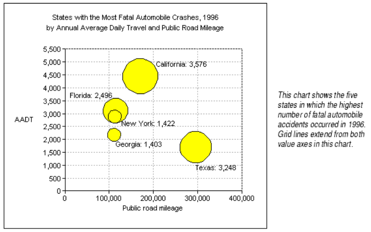
B. a bubble chart - each 'bubble' corresponds to a data point — the bigger the bubble, the larger the value. The position of the bubble on the x- and y-axes mean it shows three variables, which fits the case study in the question. In the example below, the axes could be income and population, and the size of the bubble could show life expectancy.
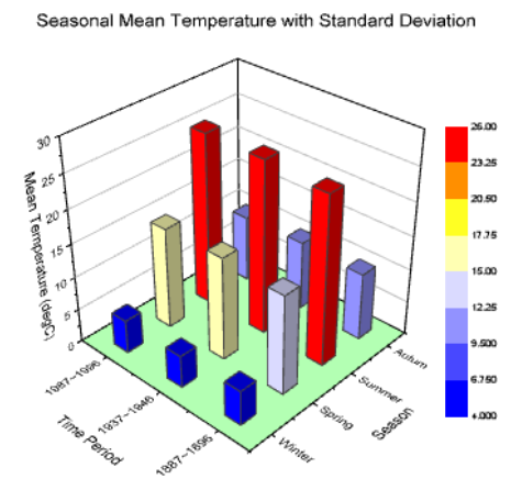
C. a 3D bar chart - can show four variables, which is more than this case needs
D. a stacked area chart - shows 2 variables (e.g. cost, time) just like a line graph, but the area under the line is subdivided into its constituent parts. It does not have a third variable.
2023-11-10 - I have written to examinations.vcaa@education.vic.gov.au to challenge this unfair question. The moral of the story for students: if you are outraged by an invalid question, give any answer. If you don't give an answer at all, you won't get a mark if the question is invalidated after a challenge. Only 32% of students agreed with the official answer. A bubble chart could show a relationship between 3 factors; the other options can only be used to show a relationship between 2 factors. |
|||||||||||||||
| A15 |
The security of data files stored on a LAN can be improved by Answer is D. Wow, This is a blast from the past. SSL 3.0 was replaced by the more secure and efficient TLS 1.0 in 1999. Yes, thrillseekers. The 2023 DA exam's cutting-edge technology question is only 24 years out of date. Laughbundles! (Yes. I just made up the term "laughbundles". It's cutting-edge, like VCAA.) OK. But let's get back to it, shall we? This is serious. Anyway - the key word in the question is "stored" - not "transmitted". Keep that in mind. A. SSL (and the new-fangled TLS) encrypts data during transmission. It does not encrypt stored data. So, option A is irrelevant. B. Audit trails track who accessed what data and when. It does not stop them accessing the data. It only helps to track them down after the event. C. Antivirus software could be said to improve data security because it would protect against data loss or damage. D. User permissions would certainly stop unauthorised 'bad actors' (e.g. Nicolas Cage) and bad singers (e.g. Britney Spears) from accessing data. 53% of students agreed with the official answer. 15% chose A and 19% chose D. |
|||||||||||||||
| A16 | Question 16 As a member of the student representative council (SRC), Roberto was asked to survey the student body about their attitudes to the school’s sports uniforms and if any changes need to be made to the uniforms The results of the survey will be presented to the principal as a dynamic data visualisation at the next SRC meeting. A. Interview users about the dynamic data visualisation. Answer is D . Keyword: 'efficient'. Recognising that automatically prunes your options. A. Interviewing is slow and expensive. NOT efficient. B. Observing users may be effective, but is also inefficient. C. Including a link is efficient (quick and easy) for Roberto, but processing the long text responses would not be efficient for him. D. Sending bulk emails is also efficient (assuming he uses a mailing list and does not send each email separately). An online survey using Likert Scales asks for a response from a limited choice of options. We've ruled out options A and B easily. Option C - provides long text answers that would provide valuable feedback and would be effective (i.e. doing what Roberto wanted to achieve) but this is not relevant to the question. It is efficient for him to send the requests via a link, but inefficient (although effective) for him to to process the wordy text responses. Option D - is also efficient for Roberto (assuming he is using a mailing list) and the responses are categorised into easy-to-process answers without long and complex explanations. It is efficient for Roberto to send the requests, and efficient for him to to process the responses, but the responses won't contain any explanations or details, so they're less effective. So - drumroll - the answer must be D. 56% of students agreed with the official answer. 25% chose C. Warning: Option C refers to sending a link. Option B refers to sending emails. This worries me. Is VCAA working in the internet stone age that did not have mailing lists? (Clue: see the SSL question above). I will be waiting with bated breath to see how the examiners justify their answer. (They didn't explain it.)
Sometimes the complexities are justified and challenging - but they are also too often caused by BADLY-WRITTEN QUESTIONS. |
|||||||||||||||
| A17 |
Which of the following is most commonly included in a disaster recovery plan? A. ethical issues Answer is D. A DRP focuses on what to do after the fæces hits the fan and it's time to start wiping down the smelly walls. The disaster has happened. Now is the time to recover from it. A. Is irrelevant. Unless you're vegan. "The building is on fire! Quick! Rescue the broccoli!" B. A good security plan would help prevent disaster, but would it help you recover from disaster? Probably not. C. A strategy is a specific, concrete method to achieve a specific, measurable outcome. A strategic plan would probably be what one needs to recover from disaster. D. Knowing how to get the hell out of a burning building would probably be Step #1 of recovering from the disaster. According to disasterrecoveryplantemplate.org (yes - websites are that specific these days), "The objective of a disaster recovery plan is to ensure that you can respond to a disaster or other emergency that affects information systems and minimize the effect on the operation of the business." Evacuating the building certainly seems to be a sensible response.
63% of students agreed with the official answer. |
|||||||||||||||
| A18 |
There was a lightning strike to the building containing a company’s network servers, which caused all data to be lost. A. a cyber threat. Answer is D. A. not even hackers can (yet) summon lightning. B. does your God hate you? (Tell me why) C. who caused the accidental lightning? Nope. D. lightning is an event, and it was a threat. That'll do, pig. That'll do, To get boring: natural disasters are event-based threats. \ 92% of students agreed with the official answer. No one chose A! |
|||||||||||||||
| A19 |
Which of the following could result from a lack of information security strategies for an organisation? A. easier retrieval of information Answer is B.
90% of students agreed with the official answer. |
|||||||||||||||
| A20 |
Physical security controls for preventing unauthorised access to data include A. biometric locks. Answer is A.
Note - "least privilege access" exists, but is not in the study design. I'm concerned about how lackadaisical the exam is when using undefined and unexaminable technical terms. 90% of students agreed with the official answer. |
|||||||||||||||
Overall for section A The use of terms and concepts that are not in the study design is concerning. Some questions were vague, others were ridiculously easy. It was not an impressive Section A. In only 14 out of 20 questions did 50% or more students choose the official answer. The average number of students choosing the official answers was 63%. It says something either about the quality of the questions, or the quality of the students - and I know what option I prefer. |
||||||||||||||||
SECTION B - short answer questionsInstructions for Section B [x lines] indicates the number of ruled lines provided on the paper for the answers. |
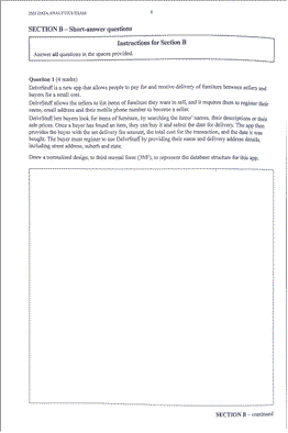
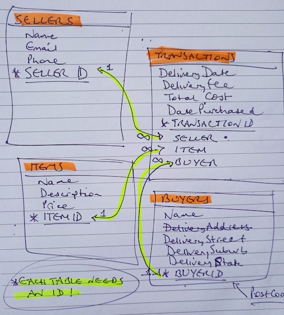
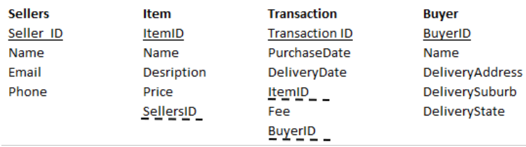
| B1 | Question 1 (4 marks) [55% of the page provided for the answer]
DelvrStuff is a new app that allows people to pay for and receive delivery of furniture between sellers and buyers for a small cost.
Wow. That's a lot of work for 4 marks! 1. Identify the necesary TABLES. 2. Read the question carefully to find the relevant FIELDS. 3. Add the RELATIONSHIP arrows. It would be wise to add the "1" and "many" (∞) labels to the ends of the arrows. (I'm not sure how fussy the exam markers were told to be about them. Markers - please anonymously let me know). 4. Use common sense: always start any database table with an ID field. IT COMPLETELY AVOIDS any possibility of a 2NF failure. I'm perpetually infuriated by exams that test for 2NF failures. It's like testing children with, "You are covered with petrol. Do you light the match or not?" The obvious answer is DON'T COVER YOURSELF WITH PETROL IN THE FIRST PLACE! Creating a unique ID in each table eradicates 2NF problems BEFORE THEY CAN EXIST. OK. Sorry for shouting. I had a lie down. I feel better now.
5. Feel satisfied that you brought your wide selection of coloured highlighters. Use them freely. Enjoy their power. You will need them for a 'modified Gantt chart' question. And don't get me started on Gantt revision questions in exams, I would need another urgent lie down. I hate them SO much. Gantt charts are done with software. They are not annotated by hand, on paper as in stupid VCAA exam questions. Arghhh! It's so... arghhh! OK. Where were we? 6. Don't be embarrassed to cross out mis-steps (e.g. DeliveryAddress). Just make it clear that you reaslised realised your slip and have fixed it. The markers will give you a mighty nod and thumbs-up
Your sole aim in the exam is to demonstrate your understanding of the key knowledge and key skills. That is all. 7. If you're nervous about creating a database schema (as you should be - it's not a trivial task), sketch out a draft answer on the back page of the exam book. When it looks right, do a proper copy in the provided space after the question. You are not assessed on any preliminary sketches. In fact you'd be mad not to make them. I certainly would sketch it out first. 8. I added a snide remark about the lack of a postcode field in the BUYERS table. This would not earn you bonus marks in a real exam answer. Save your commentary for your online exam post-mortems. 9. When you have finished, READ THE QUESTION AGAIN. Compare it with your answer as if someone (a complete moron) had written it. Actively look for stupid errors and omissions. You can only find your own errors when you assume that they were written by your most stupid worst enemy.
As evidence, I just re-read my answer above and found and fixed four - five - six typos. Thank you, Idiot Mark. Yor welkum.
Students were required to normalise the design into third normal form. Marks were awarded for.
Students did not have to show the relationships between each table to gain marks. The following is a possible answer
0.6 / 4 = 15% A dreadful state performance! |
||||||
| B2 | Question 2 (6 marks) An organisation that promotes healthy eating feels that there is not enough knowledge about the health issues of elderly people related to poor diet and digestion. After collecting and analysing data, the organisation has decided to develop an infographic aimed at educating the elderly about digestive health. a. Outline a technique the organisation could use to generate design ideas for the infographic. 1 mark [3 lines] The study design is not very helpful when it comes to giving examples of techniques to generate design ideas. It refers to "annotations to indicate key functions and appearance", and "text and diagrams". So, I would probably answer: Produce mockups to show how the infographic would look. I don't know whether other techniques would be relevant, such as - Brainstorming - get people together to throw around creative ideas without criticism or editing. Anyway... The key verb in the question is "outline". That means a brief overview. The fact that it's only worth 1 mark reinforces the hint that you should only spend about 1.2 minutes on your answer. The number of lines provided on the exam paper also gives you a clue about how much detail to include. As always, don't waste time repeating the answer. Do not say, "A technique the organisation could use to generate design ideas for the infographic is..." Start your answer after the word "is" Students were required to outline a technique the organisation could use to generate design ideas for the infographic. The most common responses that gained a mark were: 0.5 / 1 = 50% b. The organisation will need to consider design principles when designing the infographic. Identify and describe one design principle related to appearance that is appropriate for the target audience. 2 marks [5 lines] The study design sayeth:
Key words in the question: Identify and describe one design principle related to appearance that is appropriate for the target audience. Let's unpack that.
Not two design principles. Definitely not three. ONE. Providing more than one is a waste of time and ink. If you can think of three relevant answers, you must use your judgement to settle on the best one you can come up with. And good judgement is all-important in exams and life in general. I have none, so I know.
It must relate to APPEARANCE, not USABILITY. If you mess that up, your brilliant answer may be 100% irrelevant.
The target audience is elderly. What features of the solution specifically apply to them? Don't give an answer that perfectly suits five-year-old left-handed Italians. So, you could argue... Alignment - does left/centred/right justified text or images particularly apply to elderly people? Hardly. Skip that. Balance - this refers to having a roughly-equal amount of material on the left and right, top and bottom of the page/screen. So, a big picture may be placed on the left and a lot of text may be put on the right to balance it. For example...
Is balance particularly relevant to elderly people? They sometimes have balance issues, such as tripping over the cat, but balance is not especially important in their infographics. Contrast - Here we go. This is getting juicier. Elderly people's eyes gradually go wonky, especially when reading. Poor contrast - the difference between text and background colours - makes reading even more difficult. This option is a possibility. This option looks good! Image use - Infographics are essentially graphic. The use of graphics is mandatory. Graphics are not especially included for old farts. Space - separates nearby items on the printed page or on screen. Space between items makes them more distinct.
Space between paragraphs makes it clear that one topic is changing into a new topic. The space between lines (called "leading", pronounced "ledding) " makes text easier to read. Cramming text next to images (or text next to borders) is ugly and hampers readability. But it's not especially relevant to ancient wrinkled readers. Text and table formatting - Umm. You could argue that text formatting is pretty relevant to boomers. Text that is too small is hard for them to read. And we have covered contrast already. Serif fonts |
| This is good contrast |
| This is not good contrast |
(In case you can't read it, the line above says "This is not good contrast" - which sort of proves my point)
Two alternative design ideas have been created for the infographic.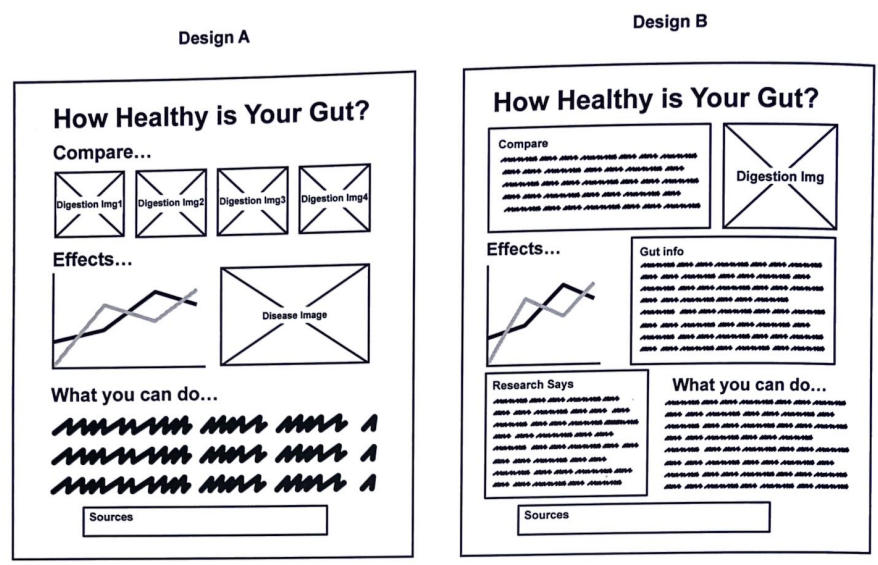
One criterion for evaluating the alternative designs is stated below:
• The infographic should be able to communicate the intended message to the target audience.
To gain full marks, students were required to identify and describe a design principle that was appropriate for the target audience. Acceptable design principles that related to appearance were: alignment, balance, contrast, image use, space, and text and table formatting.
The following is a possible answer.
"The organisation must ensure infographic uses the design principle of contrast. This ensures the elderly population are able to read provided information without difficulty, since infographic elements contrast the background."
1.1 / 2 = 55%
c. Based on the criterion above, justify which design idea, A or B, would be more appropriate. 3 marks [9 lines]
I choose A.
It has 6 images, compared with B's 2, and the value of infographics is based on their use of imagery to convey information quickly and clearly.
B contains too much text to be quickly and easily absorbed, and the text is much smaller in size than option A, making it harder for elderly people (the target audience) to read..
When a question asks you to "justify", it wants you to give good reasons to support your opinion.
Students were required to justify which design idea would be more appropriate. Only Design A was accepted; students did not gain any marks if they suggested Design B.
To gain full marks, students needed to select Design A, state a reason why it should be chosen and then state a reason why Design B would not be appropriate.
Common responses for choosing Design A were large text and more images; common responses for not choosing Design B were small text and small graphs.
The following is an example of a high-scoring response.
Design A is more appropriate because it contains a large font size which ensures elderly people who have poor vision to easily read and thus understand the intended message. Design B is not appropriate because it contains many large blocks of text with small font sizes which makes it harder to read and interpret its message for elderly people who may have vision problems.
1.9 / 3 = 63%
Question 3 (4 marks)
Caleb has completed his dynamic data visualisation on greenhouse gas emissions. He needs to test his visualisation for navigation and error tolerance of the interface.
a. Explain the difference between navigation and error tolerance. 2 marks [5 lines]
How are they not different? They have nothing in common. It's a strange question, along the lines of "Explain the difference between sheep and fire hydrants."
And does it mean the difference between their definitions, or their testing?
Navigation refers to the ability of the user to move between different parts of the solution using, for example, hyperlinks, buttons, menus.
Error tolerance is the ability of software or solutions to anticipate and deal with user errors or invalid inputs without crashing or losing data.
 |
I'm sad that this question makes little to no logical sense. |
To gain full marks, students needed to explain the difference between navigation and error tolerance.
While many students could describe what navigation was, most struggled with error tolerance. Navigation refers to the ease with which a user can move through the interface of a data analytics tool to access the features and functions they need. This includes things like the layout of the interface, the placement of menus and buttons, and the organisation of data and analysis results.
Error tolerance refers to the ability of a data analytics tool to handle mistakes made by the user. This includes things like providing helpful error messages, allowing users to undo or redo actions, and preventing users from making errors in the first place.
Error tolerance is not the errors presented in the data visualisation nor the ability to function despite errors. Students who mentioned these were not awarded the mark.
The following is an example of a high-scoring response.
Navigation is the ability to manoeuver from one area of the dynamic data visualisation to another. Error tolerance however is related to how the visualisation manages errors, this tolerance is evident when it displays warning messages instead of shutting down completely.
0.7 / 2 = 35%
b. Provide one suitable technique for testing navigation.1 mark. [3 lines]
Click on a link / menu item / button and see whether you're taken to the selected part of the solution.
|
I'm sad that this question is so basic. |
Students who gained a mark for this question had a response along the lines of: ‘Click on each of the navigation buttons and check that it opens to the correct new dashboard/page’ or ‘Click on the links and see if they work as expected’.
0.2 / 1 = 20%
c. Provide one suitable technique for testing error tolerance. 1 mark. [3 lines]
Deliberately enter invalid data (e.g. text instead of numerals, or failing to enter required data) and see if the solution satisfactorily detects and responds appropriately to the bad input.
|
I'm still sad, for the same reason. |
I'm convinced there is a basement at VCAA HQ with a team of people dedicated to coming up with weird multicultural names for case study characters.
When was the last time you saw a "Bob" or "Alice" in a case study?
![]()
Note that if a question asks for one thing (e.g. 'one suitable technique') you get no bonus marks for giving two or more.
You just waste your time trying to either show off, or (more likely) demonstrating your inability to understand the question and create a relevant response.
Your first answer will probably be the one assessed by the marker, so sit down and think for five seconds about which of your two (or more) possible answers best answers the question..
Remember - an exam is not a writing contest. It's a thinking contest.
Students who gained a mark for this question had the following responses:
• Enter incorrect information and see how it reacts; error message appears.
• Move the cursor over a point of question and check that the tip is useful and assists the user. • Move the cursor over options and check they cannot be selected.
• Click on the back/home icon to return to the home page.
A large number of students did not understand what error tolerance was and therefore could not answer the question correctly.
0.2 / 1 = 20% (86% of students got no mark at all)
Question 4 (6 marks)
Marina and Parth run an online business that allows people to buy and sell old sneakers and clothes. The data from their business is stored in a database that is hosted on a server in their office. A full backup of their business data is performed at the start of each month, and a differential backup is performed each week on Friday night. All backups are stored on an external hard disk drive (HDD) located in the office. The backups are regularly tested, and all backups are created successfully.
a. If the server had a hard drive failure, what is the maximum number of days of data that will be lost if the database needs to be restored from backup? Explain your answer. 2 marks [4 lines]
The last full backup would restore data to its state at the start of the current month.
The weekly differential backups would include data added or changed in each of the past weeks.
The worst case would be a failure on a Friday afternoon, before the differential backup on Friday night.
That would lose all new data after the previous Friday night backup, which is nearly SEVEN full days.
But, seriously folks. Second-hand shoes and clothes? Who cares about data like that? I doubt their business would last a full month, so backups would be a waste of time. Anyways...
Students were required to work out the maximum number of days that data would be lost, if the data were to be recovered from a differential backup.
As the differential backup occurred once a week on Friday night, there is the possibility that one whole week’s data will be lost if a disaster occurred on Friday night just prior to the backup being created. Therefore, seven days’ worth of data could be lost. One mark was awarded for stating seven days and one mark for an explanation of what a differential backup is.
A large number of students seem to have confused an incremental backup with a differential backup and therefore did not obtain full marks.
An incremental backup only copies modified data since the last backup. For example, if you took a full backup on Friday, your incremental backup on Saturday would only copy changes since the Friday backup. On Sunday, it would only copy changes to the backup image file since the Saturday backup.
A differential backup strategy copies only newly added and changed data since the last full backup. If your last full backup was on Friday, a backup on Saturday would copy all changes since Friday. If you took another backup on Tuesday, it would also copy all changes from Friday. The backup file size would increase progressively until the next full backup.
1 / 2 = 50%
b. Suggest and justify two changes to the backing up strategy to improve data protection and the ability to recover from a disaster. 4 marks [7 lines]
1. Continuous, automatic backups to the cloud. Every data change would be stored offsite immediately, and would be protected against local disasters or failures. This is by far the best option.
2. Weekly full backups and daily incremental backups. Data that has been created or changed since the last full backup is saved daily. So the backups are small and fast and would only lose one day's data in a worst-case scenario.
"Marina and Parth" - groan. Even the multicultural naming people in the VCAA basement must be getting sick of this desperate inclusivity by now.
Again - only give TWO changes. Not 1. Not 3. Five is right out.
It's like the Holy Hand Grenade.
Students were asked to suggest and justify two changes to the backing up strategy to improve data protection and the ability to recover from a disaster.
The majority of students were able to suggest at least one change to the backing up strategy.
Marks were awarded for identifying an improvement in the categories of:
• types of backups
• location of backups
• media used for backups
• frequency of backups.
To obtain full marks, answers needed to compare current vs suggested for two categories; responses needed to be from different categories, not from the same category.
The following are examples of high-scoring responses.
Example 1
Instead of storing the backups at on-site locations through HDD’s, store backups through cloud storage to ensure that the data backed up is located off-site and is not susceptible to local threats (e.g. Fire at business)
Example 2
Instead of conducting a weekly differential backup and a monthly full backup, conduct a weekly full back up and a daily incremental backup to ensure that in the event of threats such as a hard drive failure, data loss is minimised compared to the previous strategy.
Average mark was 2.6 / 4 = 65%
The average mark for sutdents in section B was 41%.
It demands the question of why. Were students, teachers or examiners failing?
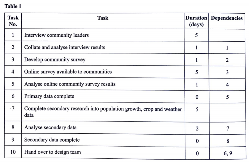
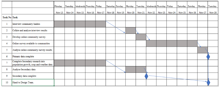
Section C - Case studyA large Australian multinational company, Grains4Food produces wheat, barley, oats and other grains. Grains4Food have offices throughout Australia and have decided that they need to build a new grain processing facility to support their three farm regions, region 1, region 2 and region 3. They believe this will help them add value to their products and improve their profits. Ali leads data analytics at the company and has been given the task of developing a dynamic data visualisation by Sara, the CEO of the company. This dynamic data visualisation will be used by Sara and the Board of Directors of Grains4Food to help determine the best location for the new grain processing facility. Sara has employed two full-time staff to join the team for the project, which needs to be completed by 8 December. Sara, along with the Board, needs to easily use and review the dynamic data visualisation to help determine the feasibility of the grain processing facility proposal. Ali has been asked to present the dynamic data visualisation so that it can be viewed through a browser, and not through a data visualisation application. Ali will need to make sure that the dynamic data visualisation represents information for each region and covers factors such as population, climate and grain production for each of the three regions for the past five years. Sara has decided that wheat will be the only grain that will be processed at the new facility. Ali’s team have decided on the tasks that need to be completed to make sure that they can present the dynamic data visualisation to the Board on 8 December. The team do not work on weekends. However, team members can work on different tasks at the same time. Part of the team will work with primary data and the rest of the team will work with secondary data. The tasks, durations and dependencies that have been decided are shown in Table 1. The project must begin on 13 November and the handover to the design team must be completed by 28 November.
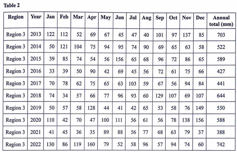
Ali has requested data from the Grains4Food farm management unit as an initial starting point for his team’s research. He has been sent seven years of data from all five regions of different grain production throughout Australia. Ali has also downloaded rainfall data from the weather bureau website for each of the regions for a period of 10 years to use in the dynamic data visualisation. Table 2 lists a sample of the data for Region 3 from this data set.
|
|||||||||||||||||||
Instructions for Section C Please remove the insert from the centre of this book during reading time. Use the case study provided in the insert to answer the questions in this section. Answers must apply to the case study. Answer all questions in the spaces provided.
|
|||||||||||||||||||
Question 1 (4 marks) a. Identify two items that should be included in the scope for the project. 2 marks [one line each]
Hmmm. Play some thinking music here (from Dvorak's Othello concerto overture, Opus 93)
So - two items that belong in the DV's scope? Determine the best location of the new grain processing facility? No. That's the scope of the the human viewers of the DV. The DV itself is not expected to be able to achieve that.
That was not at all easy for two rotten marks. And I'm still not sure I'm right. I might need to revisit this. Students were asked to identify two items from the case study that should be included in the scope of the project. Items that gained marks were: State average was 0.5 / 2 (25%) b. Identify two constraints that Ali and his team will have to consider when developing their dynamic data visualisation. 2 marks [one line each] Aha! If you were in doubt about what the previous question wanted you to talk about, this question helpfully guides you. If you were tempted in question C1 to say that the scope included the ability of the DV to be viewed in a browser, this question should make you realise that the browser issue is, in fact, a constraint = a restriction on your free will when solving the problem.
Two constraints 1. It must be easy for the board to use and review.. 2. It must be completed by 8 December. Or - it must must be viewable through a web browser. Students were asked to identify two constraints that would need to be considered when developing a dynamic data visualisation. Constraints that gained marks were: State average was 0.6 / 2 (30%) |
|||||||||||||||||||
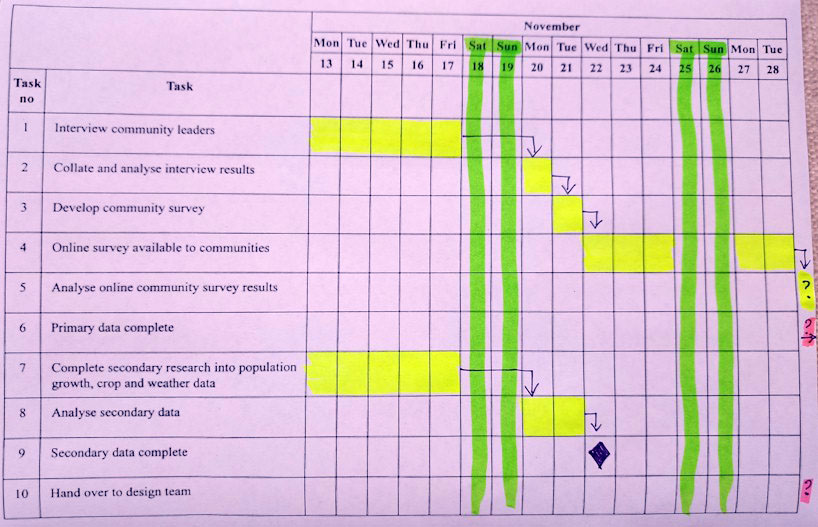
Question 2 (7 marks) a. Ali’s team have identified 10 tasks to be completed as part of the project. IMHO, this question is bad. Under exam conditions (and indeed in the comfort of my office with all the time and wine in the world) this is what I would have answered.:
You can see how it doesn't makes sense. Let's step through it.
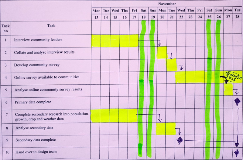
OK. Let's begin. Task 1. Five days, no dependencies. Colour in from the 13th to the 17th - five days. Easy. And colouring-in is still fun when you're 16 or 66. Task 2 - One day, dependent on Task 1. So it must start one working day after task 1 - the 20th. Task 3 - One day long, dependent on task 2 finishing first. Basically the same as we did for task 2. We're doing well. Task 4 - And this is where the wheels start to fall off. Five days' duration, dependent on task 3. You might be thinking, "Something is going wrong here... there are six tasks to go, and we're already on the last day allowed for the project? What the...?" Grit your teeth and forge ahead regardless. Task 5 - What?? A one-day task dependent on task 4? Task 6 - Is just impossible. "OK," you say to yourself. "This is a mess, but I'll do what I can. Let's go on." Task 7 - Some relief here. No dependencies, so it can start back on the 13th, goes for 5 days. Easy. Task 8 - Two days long, dependent on task 7. Task 9 - A milestone that occurs after task 8 has finished. Task 10 - This is impossible. I assumed that the team would be monitoring the survey's inputs, so team labour would have been involved. I asked an experienced VCE IT teacher to do a sanity check on my original answer, and she agreed with my logic. So, I lodged a formal complaint to the examination board. They actually wrote back, saying " Task 4 is an online survey available to communities. As it is not a task to be completed by the team, it can be completed by the online community over the weekend of Saturday 25 and Sunday 26 November. So, this is probably what the examiners were expecting students to think out and produce - in about 4.8 minutes
The case study did not make it obvious that the team did not provide labour during task 4. It just said, "Online survey available to communities", and students were forced to assume that - unlike every other task in the case study - this task's timeline could span the weekend. Such an assumption by VCAA, in my opinion, was subtle, unfair and unwarranted - especially in exam conditions when students were short on time to ruminate about such delicate nuances of wording.
I hereby administer a Double Schmacko Award of Shame.
(Why, VCAA? Tell me why. Were you bullied by a bottle of Liquid Paper in primary school?) ... it would be wise to plan your Gantt chart with a faint pencil first. When it looks right, you can go to town with the highlighters. Students were asked to complete a Gantt chart for the project showing all task durations, dependencies and milestones.
Note: Task 7 can start anytime from November 13 as long as Task 8 is completed by November 27. Tasks 7 and 8 cannot be held over the weekend. State average was 1.1 / 4 (28%) |
|||||||||||||||||||
| C2b | b. List the tasks that are not included on the critical path. 1 mark. [1 line] 7,8 That is all you need to say. (It helps you claw back the time you wasted trying to sort out C2a.) But here's the long story. The critical path is the sequence of tasks from the start to the end of the project that cannot have their durations changed without affecting the end date of the project. The length of the critical path is the shortest possible amount of time needed to finish all tasks. It is also, somewhat oddly, the longest time required to finish all tasks. Any task that can have its duration changed without affecting the end date of the project is not on the critical path. So, in this case, the critical path would be tasks: 1.2.3.4.5. Milestones are not counted as tasks because they are events - they just happen with no labour required. Task 7 could, in theory, blow out 14 more days before it affected the end date of the project. Task 8 could go 5 working days past its planned deadline before it messed with the ending date. This amount of potential 'overtime' for a task is called slack. No task on the critical path can, by definition, have any slack. Students were asked to list the tasks not included in the critical path. Responses that obtained the mark were Tasks 7 and 8. These two tasks can be delayed or take longer to complete and will not affect the end dates of the project. Task 9 was also accepted. Although it is a milestone, it is listed as a task and therefore could be included. State average was 0.4 / 1 = 40% |
||||||||||||||||||
| C2c | c. Explain why these tasks are not included on the critical path. 2 marks [4 lines] They both had slack. i.e. they could have run overtime without affecting the end date of the project. That should do it.
Simply saying, "They have slack" may be the sign that you have memorised a definition without the slightest inkling of what it means. You are being assessed on demonstrated understanding of the subject matter. You are not being marked on how well you can recite memorised definitions. Students were asked to explain why the tasks from Question 2a. were not included. State average was 0.6 / 2 = 30% |
||||||||||||||||||
Question 3 (7 marks) The team will create an online community survey that will be open for five days. The survey data will be collected once the ‘Submit’ button is pressed. The survey will collect the following data.
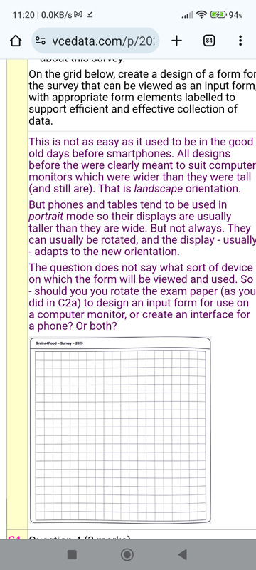
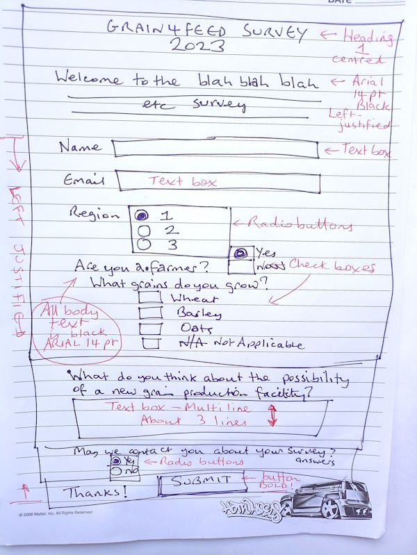
On the grid below, create a design of a form for the survey that can be viewed as an input form, with appropriate form elements labelled to support efficient and effective collection of data. This is not as easy as it used to be in the good old days before smartphones. All designs before the advent of smartphones were clearly meant to suit computer monitors which were wider than they were tall (and still are). That is landscape orientation.
But phones and tablets tend to be used in portrait mode so their displays are usually taller than they are wide.
But not always. Phone displays can usually (but not always, depending on your settings) be rotated, and the display can adjust itself to the new orientation The question does not say what sort of device on which the form will be viewed and used. So - should you design a landscape or portrait oriented input form? Or both? So you read the case study again... but it does not give a clue. Its grid is neither horizontal nor vertical: it's square, with a ratio of 1 to 0.99. Like NO display device ever created by man, woman, or goat...
So. What to do?
Let's take things one at a time. Let's consider what sort of controls to use for data entry. They need to be efficient and effective.
See? It's not the writing that gets you marks. You get marks for the thinking you do before the writing. The fiddly pen work only demonstates the quality of thy previous thinking. Charging into answers at full speed without thought is a dangerous waste of time and effort. You will not get a prize from VCAA for being the first to finish the exam paper. Stop - think - read the question twice again. Highlight key words. Read it a third time. Think again. Only then would you ... actually design the form.
The idea of a mockup is to give a designer a good idea of what you want them to produce. Describe the general positions, sizes and styles of objects. Emphasise features that you are particularly concerned about. Above, my instructions are in red ink (bring a variety of pen colours for this purpose). Do not endlessly repeat yourself: summarise. e.g. "All body text is 14 point Arial, black". You only then need to annotate the exceptions to your rule. You do not have to provide every word of the finished product, hence the "blah blah blah etc". Get the look and size and position of it right. The actual boring wording comes later. Sketching a draft of the design on a blank page in the exam book (you are not allowed to bring your own blank paper into the exam) will help you decide the relative sizes and positions of objects. As you can see, I had to add 2 extra boxes to accommodate all of the required fields. Without a prelimimary sketch, my finished mockup (which I could not be bothered producing) would have looked pretty slapdash. Also, I messed up with the "Are you a farmer?" question and needed to squeeze a pair of radio buttons into the space I mistakenly left for a checkbox. Sketching a graphic before you do your 'good copy' will make your life a lot easier, even though it does take a little more time. And I remembered to include the SUBMIT button.
Students were asked to design a form for a survey that can be viewed as an input form. State average was 3.8 / 7 = 54% |
|||||||||||||||||||
Question 4 (3 marks) The team used the online community survey to gather data, and a sample of responses is shown below. Ali has told the team that the data is not suitable for use in the dynamic data visualisation. They will need to codify the responses.
It allows quantitative and statistical analysis and summary of the comments. Students who gained one mark were able to correctly identify a reason why the responses needed to be codified. State average was 0.2 / 1 = 20% b. Explain the technique the team could use to codify the data so that it is suitable for the dynamic data visualisation. 2 marks [4 lines] Comments can be categorised simply as FOR, AGAINST, or MIXED FEELINGS about the facility. Reasons could be categorised as ENVIRONMENTAL, ECONOMIC, or OTHER. Naturally, the chosen categories are strongly affected by the themes emerging in the qualitative data. To gain marks, students were required to explain a technique that could be used to codify the data. State average was 0.5 / 2 = 25% |
|||||||||||||||||||
Question 5 (4 marks) Grains4Food wants to provide farmers with temperature and rainfall sensors to collect data from the farms. The farmer will upload the data from these sensors onto a computer on the farm's network and then send the data to Grains4Food using their internet connection. Identify and explain the purpose of two network components that the farmers need to have so they can send the temperature and rainfall data to Grains4Food. This is too vague. There are various acceptable options, depending on the internet provision and the local networks. Possibilities include:
So, let's reduce ourselves to thinking like an exam writer. This is not pleasant, I know: I have written many exams, and it is not nice to have to think like I do. Ask my mum. What were they (probably) confidently expecting the average competent student to say? Let's not overthink it. Network component 1 Modem. Purpose of network component 1 Receive and transmit data to and from the internet service provider, and then to/from Grains4Food. Network component 2 Network interface card Purpose of network component 2 Allows the computer to send and receive data from other networked devices (such as the modem). I mean - honestly - I can't think of any other network device that must apply to ANY and ALL farmers. The markers may think, "What? But a NIC is so basic... Surely it can't be that. I was thinking it should be..." Yes - but a NIC is a vital network device (often overlooked nowadays because it's usually incorporated invisibly into motherboards with only an RJ45 ('Ethernet') port to show for its existence) but it's still crucial to connect to a local area network.
Prove me wrong. You may begin. Students were asked to identify and explain the purpose of two network components that the farmers need to have, to send the temperature and rainfall data to Grains4Food. Average mark was 1.9 / 4 = 47.5% |
|||||||||||||||||||
Question 6 (4 marks) The primary data collected at the farms needs to be securely sent back to Grains4Food. a. Explain how a software security control can be used to protect the data as it is sent. 2 marks [5 lines] Key word 1: software. Not hardware. Keyword 2: as it is sent. Not when it is stored. TLS (Transport Layer Security) which replaced the older SSL (Secure Sockets Layer) encrypts data in transit. If the data is intercepted during transfer, it is (effectively) unreadable. Only the authorised recipient has been given the unique decryption key. Note - I didn't just say "Use SSL/TLS." 1. The question asked me to explain, which requires an explanation of the choice I made. Simply naming stuff is not good enough. 2. As noted above, simply spouting jargon and acronyms does not show you have done anything more than memorise letters that apply to a certain type of question. Prove your understanding. To gain marks, students were required to give an example of how a software security control could be used to protect the data as it is sent. Average mark was 1.1 / 2 = 55% Once again, the examiners refer to SSL (Secure Socket Layers) which was officially deprecated [declared obsolescent] in 2015. b. The collected data will be stored on a ‘network attached storage’ device at Grains4Food. Outline one advantage and one disadvantage of using a ‘network attached storage’ device. 2 marks Advantage [ 2 lines] The data stored on the NAS is shared by, and available to, all authorised users on the LAN. This lets everyone share a single, central, authentic copy of the data. Disadvantage [ 2 lines] If the NAS fails, the only source of authentic data may be lost, unless it's backed up. (Using a RAID array minimises the risk of loss through a single disk's failure.) or Expense - a NAS is not cheap, and filling it with large-capacity high-quality hard disks is very expensive. Yes, the RAID comment is included to be risky. It really is relevant - sort of, vaguely - but it is also a bit like showing off. Now is not the time to indulge in your personal pet topics. (I, for example, love NAS. I have a NAS that I like to talk about at parties. Which explains why I don't get invited to parties. But anyway, it's a purebred Synology DS418 with four 12TB drives configured as RAID5. His name is Norbert... Anyway, you have better things to worry about right now - like C7.
Gird your loins, answer the question that was asked. Then move on. If you have the luxury of spare time when you finish the exam, consider enhancing previous answers with your bonus wisdom - but only if it is relevant to the question. If you add layers of irrelevant blather to good answers, you risk looking like you didn't know what the question actually was asking - and that may harm you. e.g. Q. Why are cats good pets? A. They purr and catch mice. (FULL MARKS) Late addition: But cats aren't as good as otters, which love to swim. (The marker starts to have doubts about your ability to read a question.) P.S. While the NAS is a very specific piece of network hardware, it is good to see that it is named in the study design's key knowledge (U4O2 KK05). Good examiners! Students were required to state one advantage and one disadvantage of using a ‘network attached storage’ device. (cough) WATCH THIS SLIDESHOW The most common acceptable responses for an advantage were: • fast storage and retrieval as data is local The most common acceptable responses for a disadvantage were: • as the number of users increases, a large increase in traffic over the LAN may slow performance Average mark was 1 / 2 = 50% |
|||||||||||||||||||
Question 7 (2 marks) [4 lines] A member of Ali’s team has found an online blog post by an unnamed user, called ''The Importance of Grain to all Aussies’, on the website ‘Grains Rule the World’ Justify whether Ali's research team should use this information in the dynamic data visualisation.
Note 1 : make it clear whether you think they should or should not use the information. Note 2 : give reason(s) for your decision. They should not use the information. The reliability and credentials of the source are unknown and need to be corroborated. The accuracy of their information has not been proven or validated. The site's name seems biased in favour of grains, so it may be prejudiced and unreliable. I have no problems with this question. Surprise!  I give this my Stamp of Approval for questions I like. Yes, Phil. It can happen. To gain full marks, students were required to justify why a particular resource should be used. This needed to include that the authenticity of the information is in question, or the information could be biased (one mark) and that this is a result of an unknown author or a non-credentialed website source (one mark) Ali’s research team should not use this data as they do not know the origin of the data and it is not from a trusted source and may not be authentic data and therefore would harm the integrity of Ali’s data. Average mark was 1.1 / 2 = 55% |
|||||||||||||||||||
Question 8 (1 mark) [3 lines] The research team must reference all sources they use according to the American Psychological Association (APA) referencing standard. It allows readers to inspect the original sources of the data referenced by the producers of the dynamic data visualisation. or It confirms that the data is not plagiarised, and was produced by people other than the authors of the visualisation or It acknowledges the copyright of the authors of the original research. Note the word "or" above - do NOT give three alternative answers even if you can. Thank Dog the exam didn't ask for a fully-formatted example of an APA citation, including hand-written italic text - as they have done in the past. That really would have been too much under exam conditions. Well done, examiners: ít's a reasonable question within exam constraints. (Do I sound surprised?) To gain a mark, students were required to give a reason why sources should be referenced. Acceptable answers were similar to:
Average mark was 0.7 / 1 = 67% |
|||||||||||||||||||
Question 9 (4 marks) Ali thinks that collecting data through a Geographic Information System (GIS) is a good technique for efficient and effective data collection for each of the regions. a. What are two components that could make up a GIS data set? 2 marks [4 lines] Rainfall Wheat production I don't know why the exam provided 4 lines for the answer. It didn't ask for explanations or justifications. Rainfall seemed particularly interesting to Ali, according to the case study, so I chose that. And wheat (according to Sara) is the only grain they will process. So that seems most relevant too. You could equally have opted for components like
It was clear from the student response that a large number of students did not know or understand what a Geographic Information System (GIS) was and therefore did not gain any marks for this question. Students were asked ‘What are two components that could make up a GIS data set’. Average mark was 0.5 / 2 = 25%
Ali can use the data to justify the choice of the facility's location. Good rainfall and high wheat production are good evidence to support the choice of a region, since those factors would increase productivity.
And/or you can see my GIS slideshow. As a large number of students did not understand what was being asked in part a., they also struggled to gain marks in part b.
Average mark was 0.2 /2 = 10% Guys and gals - I'm sympathetic to your cause, but that result was pitiful. |
|||||||||||||||||||
Question 10 (3 marks) The team needs to select a design tool to represent the designs for the development of the dynamic data visualisation. List the most appropriate design tool for the following components of the dynamic data visualisation.
Average mark was 1.2 / 3 = 40% |
|||||||||||||||||||
Question 11 (2 marks) Ali has been monitoring the progress of the project since it began. Explain a technique that can be applied to the Gantt chart to record this progress. Technique Milestones Explanation Milestones mark significant points in a project's progress. If a milestone is not reached by its due date, the project is behind schedule. Another possible answer would be task dependencies. They indicate when a task should be finishing and a dependent task should be beginning. Any change to the earlier task wtill affect the start time of the dependent task. And Samer has reminded me that the study design says in U4O1KK09, "techniques for recording the progress of projects, including adjustments to tasks and timeframes, annotations and logs" Thanks, Samer. Good point! To gain marks, students were required to explain a technique that can be applied to the Gantt chart to record this progress. Average mark was 0.6 / 2 = 30% |
|||||||||||||||||||
Question 12 (7 marks) The team will manipulate the data collected from the weather bureau using spreadsheet software. a. Identify and describe two techniques that Ali could use to validate the data in the spreadsheet. 4 marks Existence check - A value must be entered. Data validation technique 2 Type check - Value must be numeric. The question fed technique 1 to you on a plate:.. "with no blank cells". You can't complain that you weren't told. This should be YOU approaching the answer to technique 1...
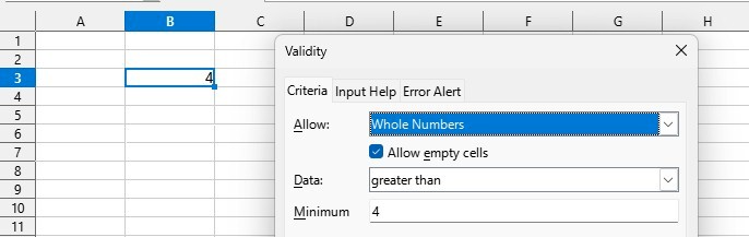
My chosen technique 2 is based on the nature of the rainfall data. You could have applied a range limit (e.g. 0 to x) but that really depends on how much you enjoy being called an idiot. BONUS: Here's an example of applying validation rules in a (LibreOffice) spreadsheet You can also specify what the spreadsheet should do if invalid data is entered.
Students were asked to identify and describe two techniques that could be used to validate data in the spreadsheet. Average mark was 1.8/4 = 45%
Manually calculate the annual total rainfall for region 3 in a year and compare your total with the total calculated by the spreadsheet. Annual total (mm) is the only calculated value in the spreadsheet. It's the only value that can be tested. Repeat after me: Data is validated. Calculations are tested. Never confuse the two. Right? Right! Excellent. When asked to describe a technique to test the functioning of a spreadsheet, students need to include three steps: Average mark was 0.4 / 3 = 13% |
|||||||||||||||||||
Question 13 (6 marks) Ali imports the prepared spreadsheet data for rainfall into the data visualisation software. a. Identify and outline one format and one convention that could be applied to produce a data visualisation that would be the most effective in showing the comparison of annual rainfall for the three regions for the past five years. 2 marks
Also, note that you need to (a) identify and (b) outline the format and convention. Two things to do. Forget one, and you lose marks. Format [2 marks, 3 lines] A line graph / chart with 3 lines showing the rainfall (vertical axis) for the 3 regions over the 5 years (horizontal axis). Convention [2 marks, 3 lines] Use different coloured lines for the 3 regions. This makes each region identifiable. or Label the axes to indicate the quantity of the variables (rainfall, year). OK. Theory time Everyone go "Yay!". What? Nobody? Sigh. A format is a chosen method of presenting data or information. It is the vehicle, so to speak, to carry the conveyed information. Formats include text, picture, graph, animation, webpage, slideshow, music, morse code, etc. A convention is a standard, accepted rule or guideline that should be used once a format has been chosen. e.g. once you decide to present data in a graph, there are standard practices to producing a good graph, such as labelled axes. Students were asked to identify and outline one format and one convention that could be applied to produce an effective data visualisation. They needed to identify a line chart/graph as the format and outline how it was effective as well as identify a convention relating to the graph (axis title, chart title, scale or legend) and an effective reason for using the conventions. Average mark was 0.4 / 2 = 20%
It is pictorial, which suits a data visualisation. It is quick and easy for non-specialists to interpret, and would have a greater impact on them. It also condenses a lot of detailed data into a small space. To gain marks, students needed to explain why the selected format is preferred to educate the target audience. Responses needed to state that the line chart showed changes over time (one mark) and that it involves a trend/pattern and/or compares data over time (one mark). Average mark was 0.3 / 2 = 15%
A dynamic display of a graph is possible. It means that that graph constantly refreshes itself as the data changes in real time. I can't really think of an answer to this, apart from a trivial animation, such as... Animate the graph lines so they gradually appear month by month across the graph. or Animate the graph so the 3 regions' lines appear one after the other, in order from lowest rainfall to highest rainfall. It all seems so pointless and ... Desperate to be Dynamic.
Students were required to outline a feature that could be added to their selected format in order to create a dynamic display of the comparison of annual rainfall for the three regions. The following is an example of a high-scoring response. - The graph could have a checkbox feature that allows users to switch between the data visualisation of each region, and then select and choose the ones they wish to compare at each moment. Average mark was 0.6 / 2 = 30% |
|||||||||||||||||||
Question 14 (4 marks) Ali has completed the project and wants to assess the effectiveness of the project plan in managing the project. Factor 1 [1 line] Project completion rate Discussion [4 lines] How often and accurately did the project plan's milestones match actual task deadlines? If the Gantt's milestones were achieved either late or early, it would not be considered effective. Factor 2 [1 line] Error rate Discussion [4 lines] If a timeline led to tasks failing, being left incomplete, or causing staff unhappiness - the predicted schedule was proably ineffective. Wow. Those 'discussion' questions ask for a lot of writing for one mark each. I really have no idea what the examiners were expecting me to say. So I had to resort to using Common Sense ™ instead. - Another factor might possibly have been whether tasks were finished within their allocated budget, but Gantt charts don't tend to pay much attention to specifiying the cost of tasks. - Also, client satisfaction might be a factor. If the project plan did not lead to the client being satisfied with the results, a bad project plan might have contributed to the problem. - Scope might be a factor. Did the finished project successfully accomplish all of the tasks that were actually necessary, or were vital tasks left out? To gain marks, students needed to propose two measurable factors and discuss how each factor could have contributed to the effectiveness of the project plan. Average mark was 0.5 / 4 = 13%
|
|||||||||||||||||||
Question 15 (2 marks) [5 lines] Sara was attending an industry event when she was approached by a fertiliser company that wanted to support Grains4Food’s farmers. The company was willing to offer a 20% discount to all farmers on any fertiliser they bought, but requested that Grains4Food send them the farmers’ personal contact information. Should Sara be worried about this request? Outline a relevant legal issue related to this request. Sara should be worried. Disclosing personal information without consent is - at least - an ethical problem. She might be violating the Privacy and Data Protection Act 2014 (Vic) and its Information Privacy Principle #2. The farmers have not consented to let Sara disclose their personal information for a purpose other than for which it was collected. This is a biggy, and I suspect most students will be feeling something is dodgy but not able to identify a particular law. OK. Let's take this apart. The Australian federal Privacy Act (1988) applies to :
Let's scan the other legislation specified in the study design's glossary:
Students needed to state if they should be worried about a particular statement and in doing so include any relevant legal issues. Average mark was 1.1 / 2 = 51% |
|||||||||||||||||||
Section C SummaryThe average mark for students in section C was a pathetic 34%. How can this be explained?
|
|||||||||||||||||||
END OF QUESTION AND ANSWER BOOK |
|||||||||||||||||||
Back to the IT Lecture Notes index
Back to the last page you visited
Created 2023-11-07
Last changed: May 15, 2024 12:36 PM
Original Content © Mark Kelly 2023
Images and questions are © Victorian Curriculum and Assessment Authority.
Reproduced here with permission for educational purposes.


Section C summary
It seems that students' performance in this exam was TERRIBLE. Some of it may be attributable to the exam questions, but it must be clear that students are not going into the exam properly prepared with basic theory and skills.
Come on, guys and girls. Get your act together.
And teachers: get your theory hats on and hit that key knowledge thoroughly. Don't just read my slideshows out loud.
This is just embarrassing.
--
This is my first post mortem for an exam with a section C - other than Software Developnment.
I approve of the move, but it makes me wonder why section B persists. It achieves nothing that sections A or C could not do.
I hope this post mortem has been useful. Tell me if you have problems or suggestions.
And let me leave you with this final thought: take on knowledge like a hungry puppy.